Navigation flow of the Payment feature
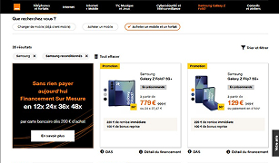
Catalogue Page
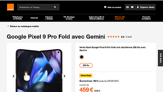
Detail Product Page
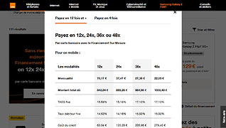
Popin Product Page
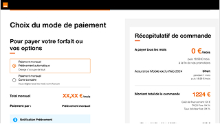
Payment Page
New Product Design.
Orange had already seen the success of the 4-installment credit-card plan (4 × CB): the average basket value rose by 42 %.
The Finance Department now wanted to extend the PxF instalment offer (12 ×, 24 ×, 48 ×) in partnership with Cetelem.
Drive average basket value from €650 to €750 by launching a clear, conversion-friendly credit offer—without compromising the purchase flow.

Catalogue Page

Detail Product Page

Popin Product Page

Payment Page
| UX Phase | Key Action | Result |
|---|---|---|
| Research | Harris quantitative report, Usabilla feedback, stakeholder interviews | Extracted actionable insights and clarified market standards and user understanding of credit offers. |
| Workshops | Design-Thinking (discovery & ideation) | Stakeholder alignment |
| Testing | Moderated user testing protocol writing | Validation of comprehension and usability |
| Implementation | Dynamic prototyping, final UI | Dev-ready deliverables, accessibility testing |
| Insight/Metric | Data Point | Details |
|---|---|---|
| Share of purchases completed with an instalment plan (FSM) | 40% | The 24-month plan is the most popular monthly option. |
| Increase in average basket value when using “Pay-in-4” by credit card | +42% | Basket size rises from €541 to €766. |
| Impact on accessory attachment | 30 % of carts | This payment method encourages customers to add accessories. |

Competitive benchmarking grid
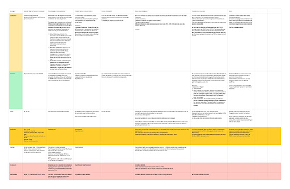
User Journey Benchmark Matrix
Key insights surfaced through the analysis framework, coupled with a solid grasp of market benchmarks and a clear, user-friendly approach to credit education.
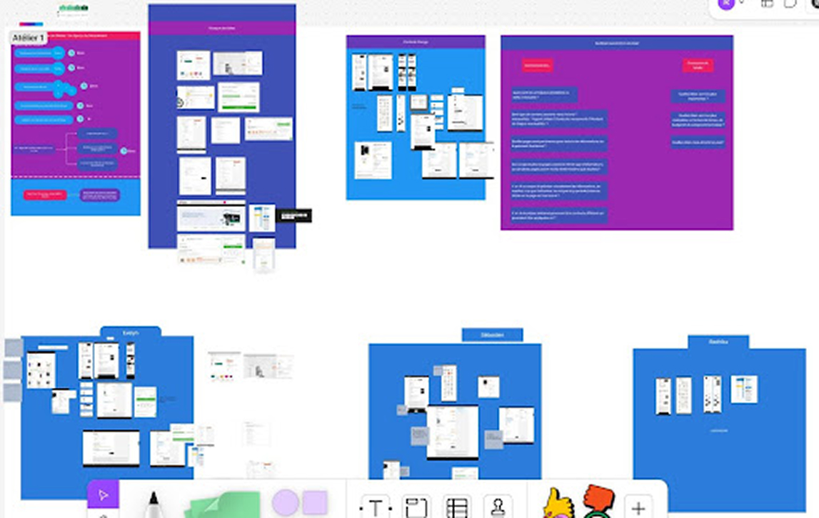
A screen of the collaborative workshop on Figma
Challenge The Product Owner was going on extended medical leave. A temporary PO was stepping in, and the project needed to continue without losing design coherence or strategic alignment — especially with multiple stakeholders involved.
I organised a collaborative session with both the returning and interim POs, PM to align perspectives, provide full context, and secure buy-in before the handover.
Impact :The workshops helped maintain a unified design direction throughout the transition. The initial mockups became a central reference point, and the returning PO was able to seamlessly rejoin the project without disrupting progress or undoing prior work.
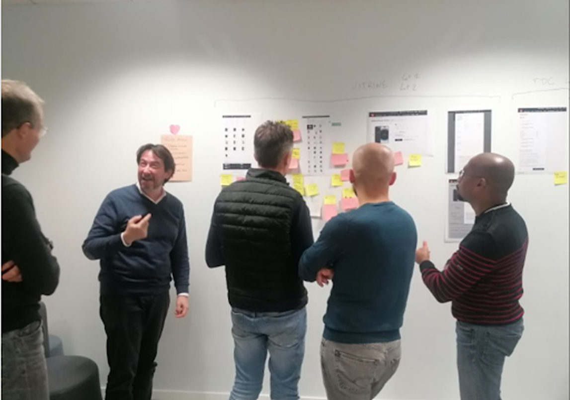
Alignment and validation workshop
Running four step-by-step workshops with 12 stakeholder representatives fast-tracked sign-off and kept timelines intact by sparking ideas, aligning decision-makers, and enabling live validation.
Intended Outcomes : Our targets were rapid, single-round approvals, early marketing buy-in, and a renewed, open dialogue with the design team.
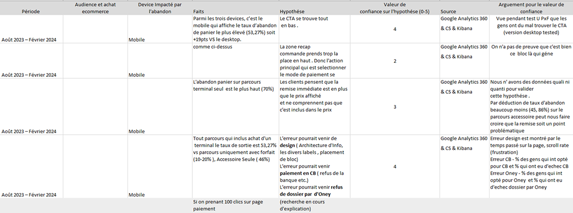
A single, centralized document was created to bring together

An analysis grid was built from 16 moderated user tests.
Goal: structure the feedback to pinpoint friction points and rank the optimizations to tackle first.
Outcome: a concise, end-to-end view of UX pain points across the entire split-payment journey.
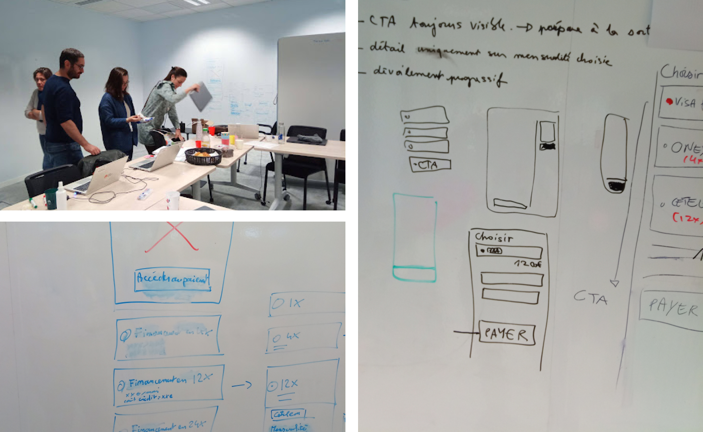
Objective Remove the pain points uncovered in the previous round of testing.
Results
User testing exposed two key issues with the existing payment page: users struggled with long, unstructured scrolling and a lack of clear information architecture. From a technical side, developers had to rebuild the page entirely whenever a new payment module was added, creating unnecessary overhead. This combination of usability and development inefficiencies made a complete redesign essential.
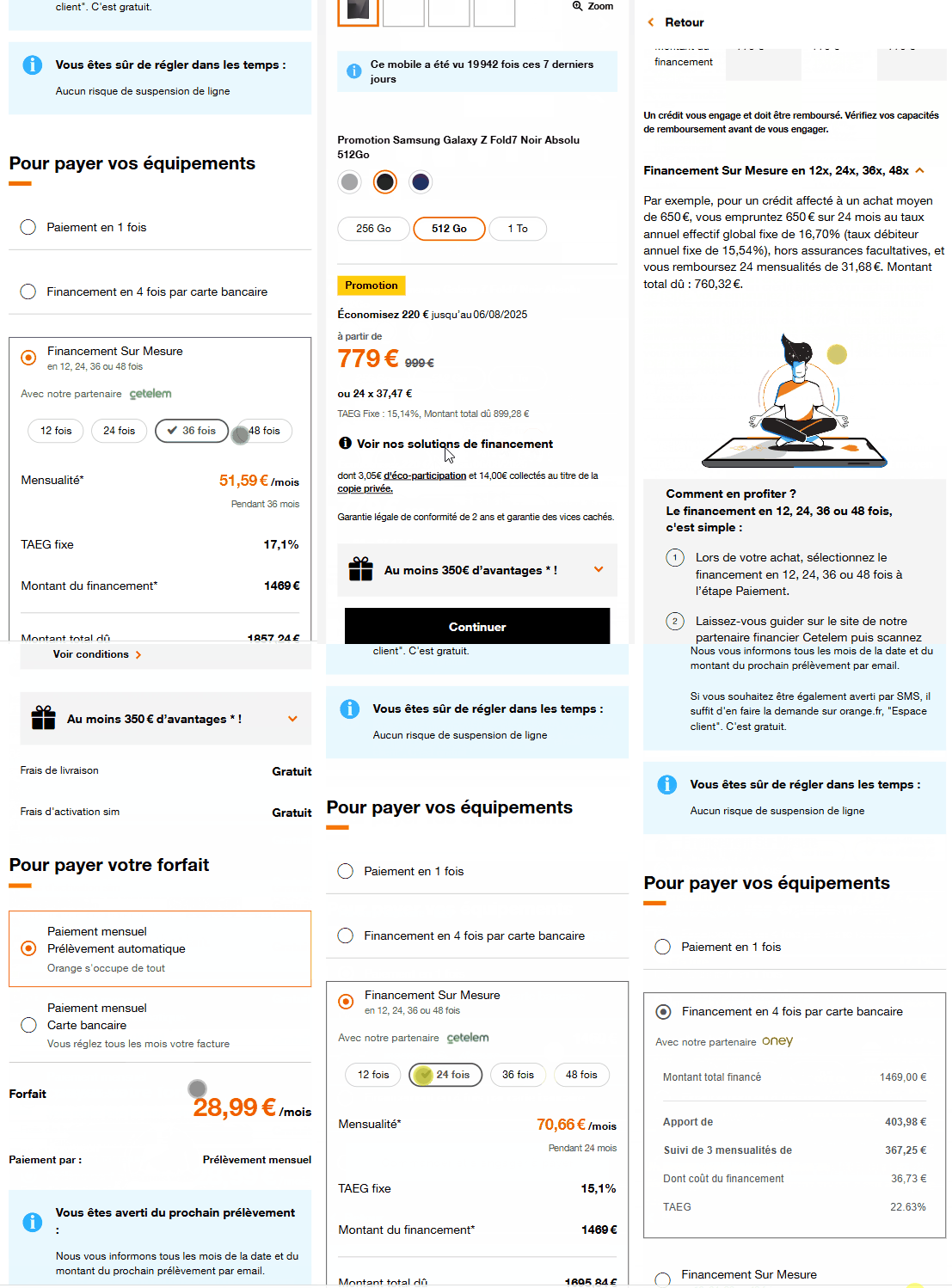
The Redesign The checkout flow has been clarified, with payment options grouped into clear families.
Interactive chip selectors make choosing a 12- or 24-installment plan effortless.
Key figures are surfaced up front: monthly payment, APR, and total cost.
The redesign also streamlines implementation by simplifying both the front-end and the underlying business logic.
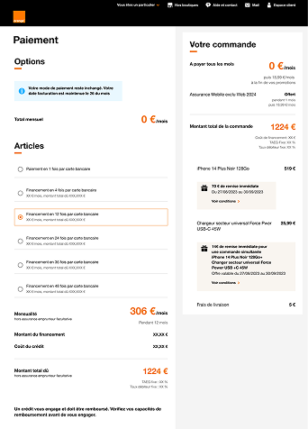
The old design The page is dense and confusing, overloaded with competing information.
The financing block is buried and hard to spot.
Frequent errors occur on both the development and back-office sides.