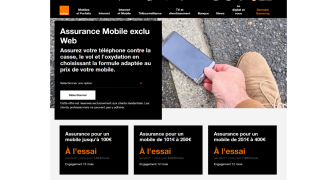
Before : The Old design
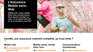
After -The new Design
Page Redesign.
Before I joined the project, the Mobile Insurance landing page had already been examined from every angle:

Before : The Old design

After -The new Design
| UX Phase | Key Action | Collaborators | Results |
|---|---|---|---|
| Research | Harris & Usabilla studies | PO, Business Owners | Located user pain-points; defined first use-case for workshops |
| Workshops | Design-Thinking (discovery & ideation) | PO, PM, Data Analyst, Architecte, Marketing Managers, Business Owners | Rewrote the insurance offer narrative into a clear, user-friendly message, leading to a testable press communication for focus group validation. |
| Testing | User Testing, digital focus groups | UI Designer, Data Analyst, Marketing Managers, PO | Wireframed, iterated, and tested the landing page and explanatory pop-in. |
| Delivery | Wireframes, UI management | Front-end Devs, UI Designer, Architect | Higher conversion, smooth user adoption, and a fluid handoff to UI and development teams. |
| Metric | Before | After | Δ(%) |
|---|---|---|---|
| Click-through rate | 1.42 % | 2.15 % | +51 % |
| Abandonment rate | 82% | 65% | –21 % |
| User comprehension (Usabilla) | 50% | 80% | +60% |
| Attachment rate | 7.7% | 7.9% | +2.6% |
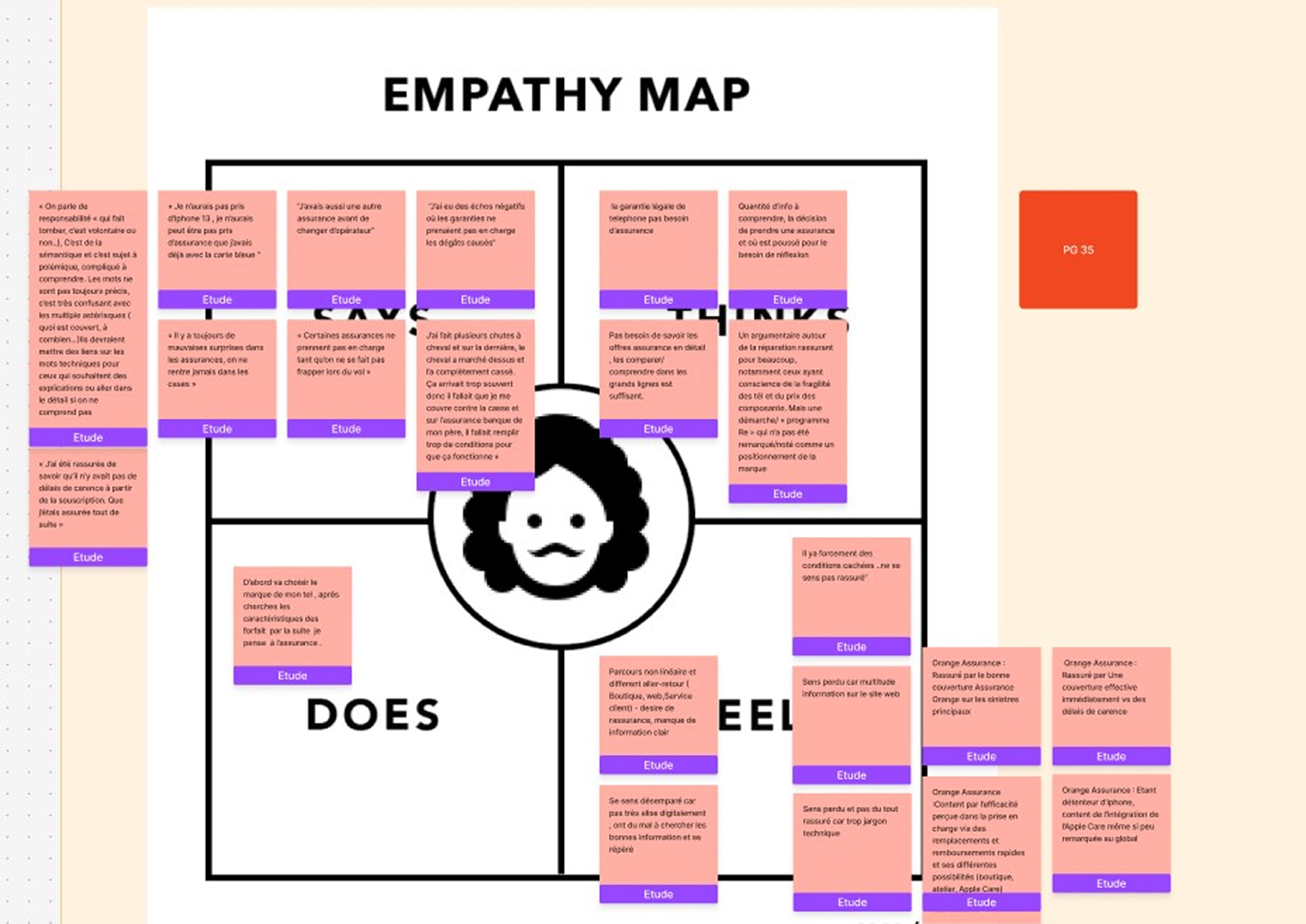
Empathy Map based on existing studies (Harris, Kantar) and Usabilla feedback.
“Il y a forcément des conditions cachées, je ne me sens pas rassuré.”
“Je me sens perdu avec la multitude d'informations sur le site, souvent trop techniques.”
Verbatim client (Usabilla)
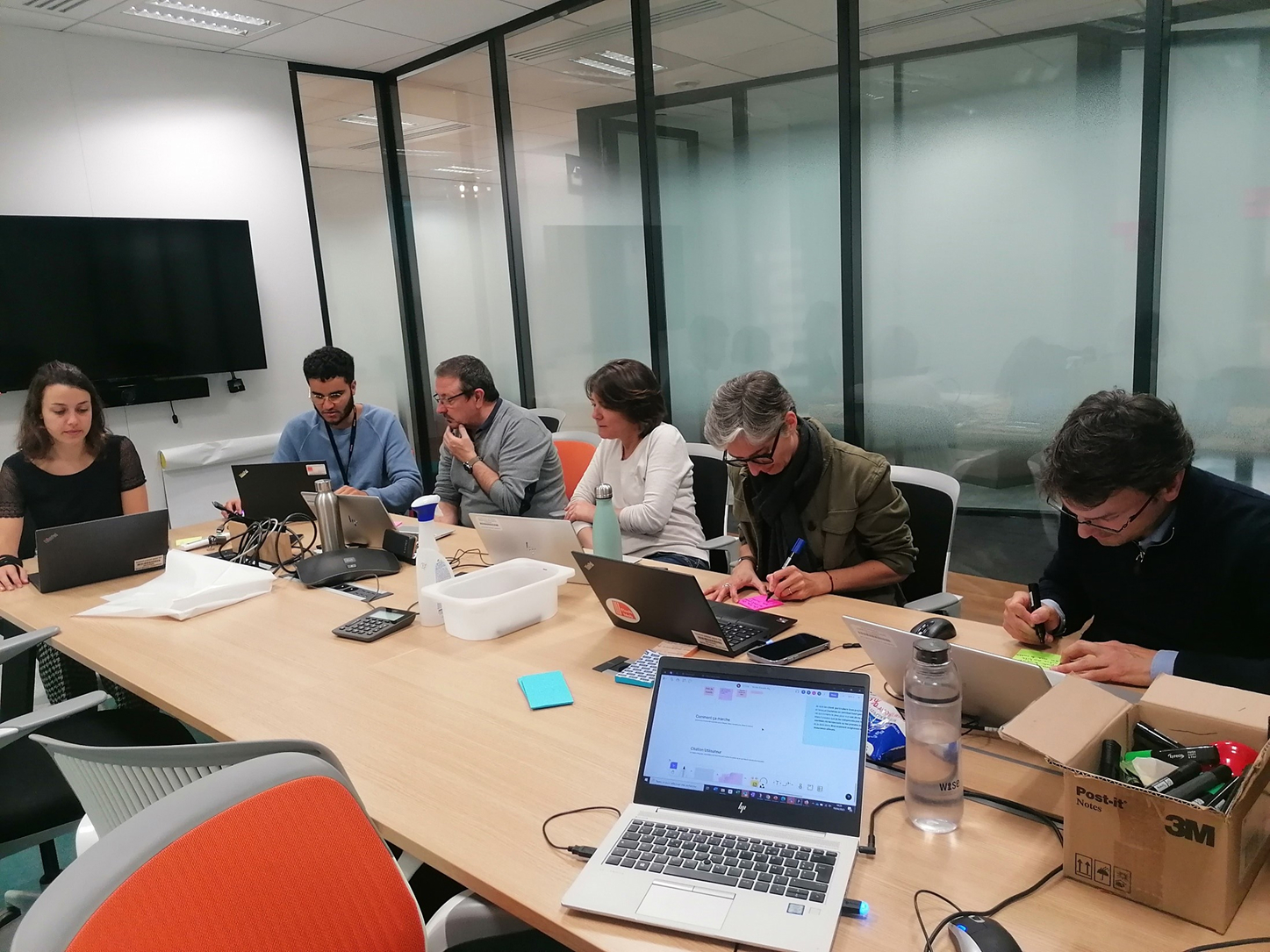
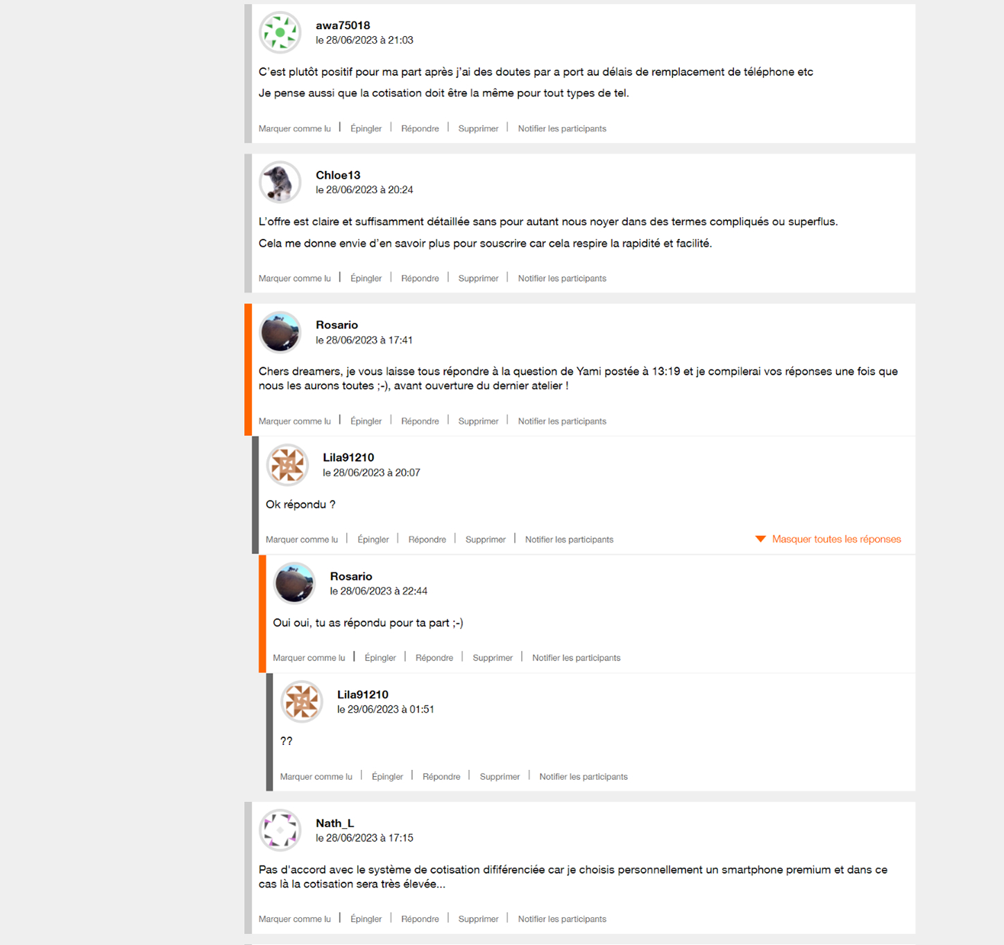
Design-Thinking workshops with marketing, data, e-commerce (12 people).
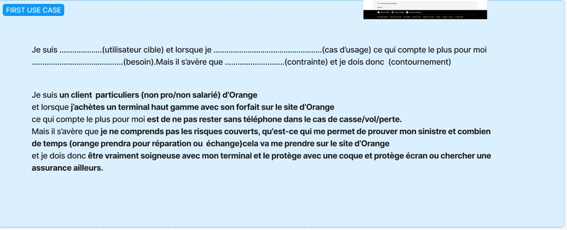
Step 1 – Pinpoint the primary use-case
Focused on users’ need for security and control: first make guarantees crystal-clear, then simplify the claims flow, and highlight Orange’s “stay-connected” solutions during an incident.
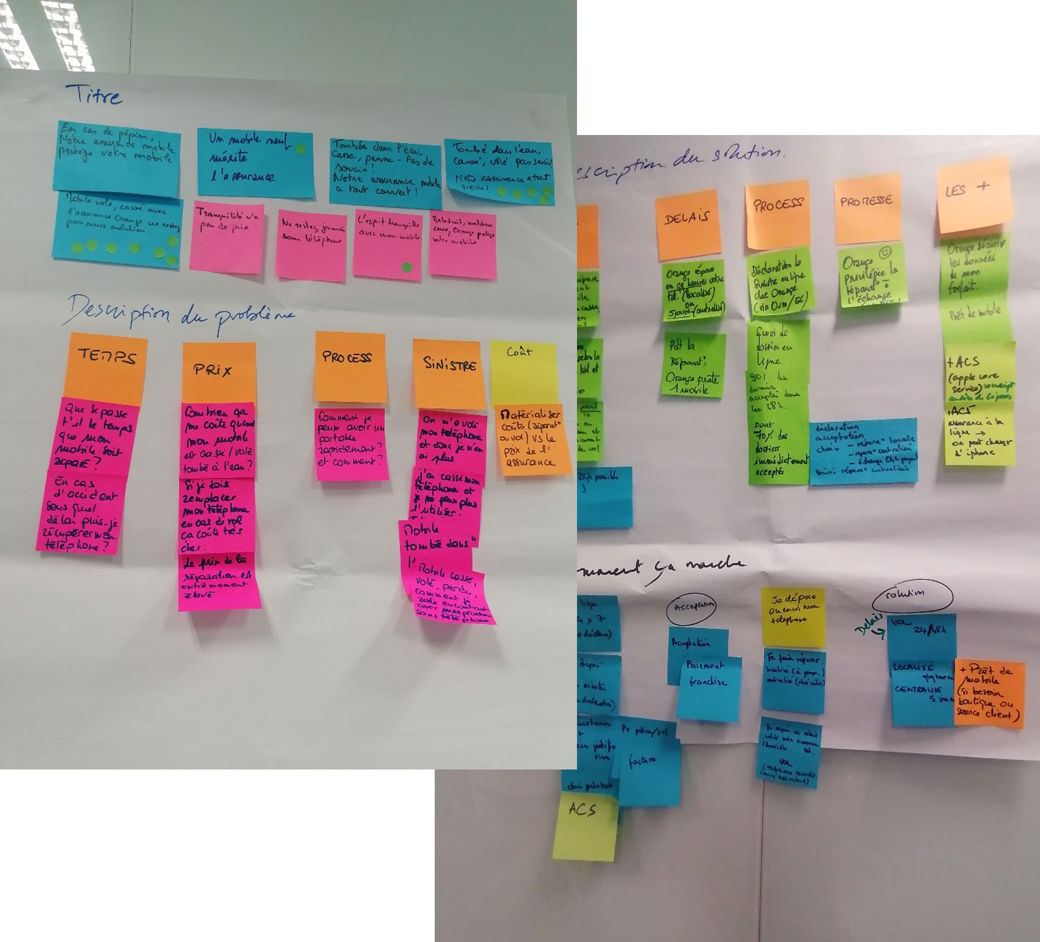
Step 2 – Craft the offer story
Co-creation workshop to shape a user-centred narrative showcasing guarantees, process, and Orange advantages.
Impact: a crisp story testers understood at first reading.
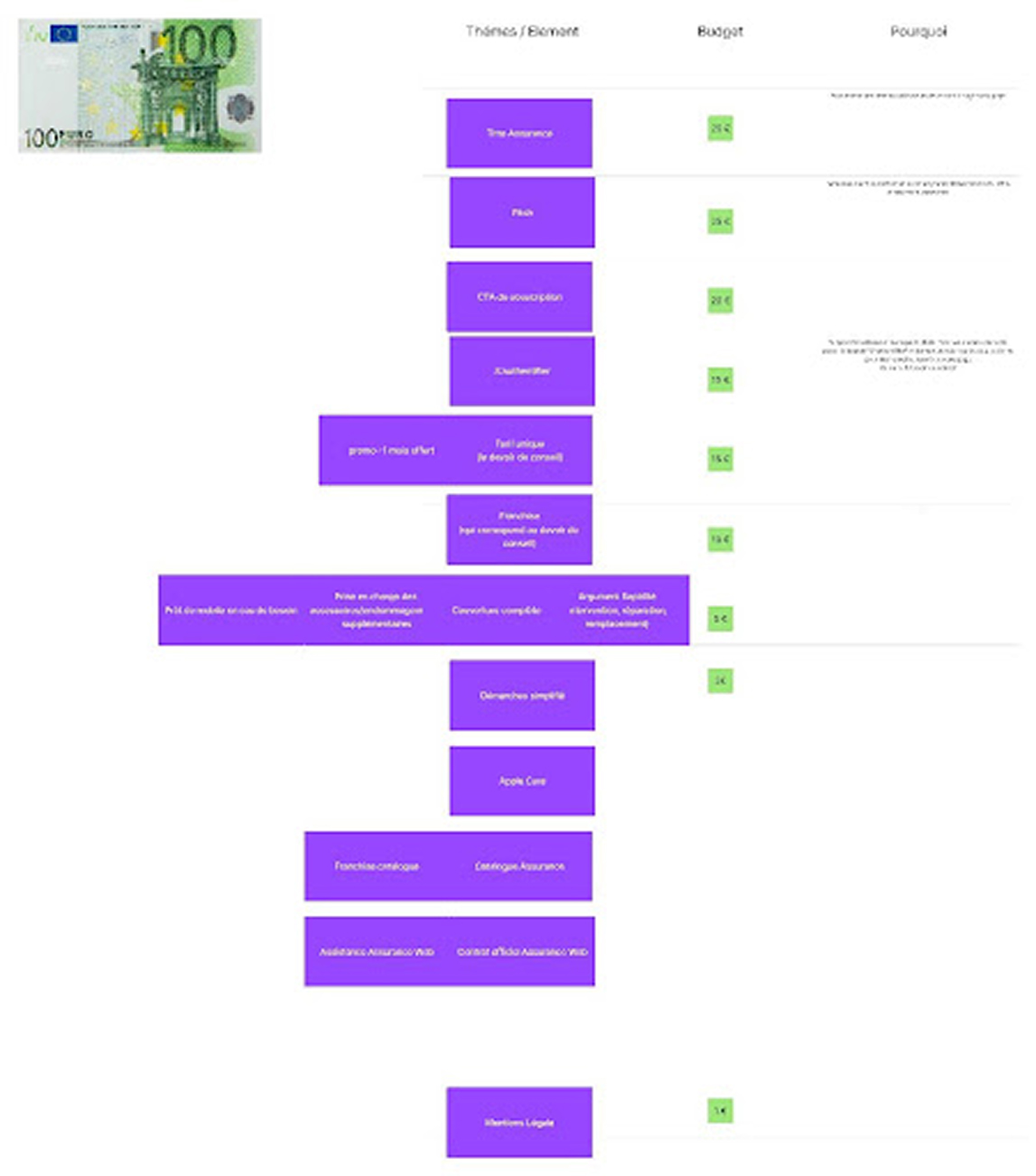
Step 3 – Build the information hierarchy
Collaborative session organising page elements—headings, sub-headings, guarantees, claim steps—balancing business priorities with user pain-points.
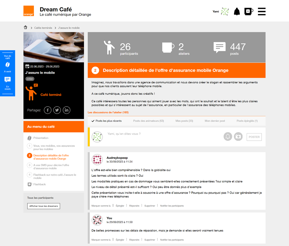
Worked well : Cross-functional workshops → strong alignment and adoption.
Next time: Test earlier involve UX writers from day 1; favour continuous improvement over full redesign.