Institut Pasteur – Ma Voix
Enabling Communication for Adolescents & Adults with Autism spectrum disorder and associated intellectual deficiency.
- Date: February 2021 - August 2021
- Duration:7 months
- Role: UX Designer
- Missions: User Research, User Testing, Co-design workshop animation, Wireframing and UI design
- Team: 1 back-end developer, 1 front-end developer, 2 Speech analysts, 1 psychologist
- Sponsor: L'Institut Pasteur
Context
Ma Voix is a digital communication tool designed for non-verbal adolescents and adults with autism and associated severe intellectual disability.
The project was part of the Connect research initiative led by Roberto Toro’s lab at the Institut Pasteur.
It was developed for the Institut Médico-Éducatif (IME) Cour de Venise, Paris, which hosts 25 students aged 16–21 with moderate to severe autism and very different communication skills.
At IME:
- Some students speak, some use isolated words, gestures, or no verbal communication at all.
- Most non-verbal profiles use PECS (Picture Exchange Communication System) - a method using pictogram cards to build sentences.
- Many relied on paper pictograms, which created ongoing logistical challenges later addressed in the design phase.
Project Goal
- Design a usable, accessible Android communication tool aligned with the cognitive and motor abilities of non-verbal adolescents/adults with ASD.
- Replace the costly, fragile iOS (Pyramid PECS) setup while ensuring a smooth transition for users and caregivers.
- Co-design and test with speech analysts and educators to support real-world adoption.
My Role & Key Actions

Through immersive user research and collaborative co-design, I partnered with speech analysts and educators to define and address the core challenges faced by non-verbal users. The result was a well-researched MVP that streamlined communication through a redesigned AAC tool, informed by direct user feedback and expert validation. This work led to a new interface with features like cloud sync and a timetable module, ready for development.
| UX Phase | Key Action | Collaborators | Results |
|---|---|---|---|
| Discovery | Observed IME for 11 days using a Designer’s Notebook to record interactions, tasks, and frustrations (e.g., “I want cheese” request). | Speech analysts, educators | Mapped real communication flows. Identified task breakdowns and pain points in physical tool preparation. |
| Ran Hierarchical Task Analysis to break down complex student–educator interactions. | Speech analysts, educators | Clarified multi-step tasks. Revealed opportunities where digital tools could reduce effort. | |
| Created typological datasheets on cognitive, behavioural, and language profiles; validated with key staff. | 2 Speech analysts | Defined primary design group: non-verbal users able to request via pictograms. | |
| Definition | Developed 4 personas (3 ASD adolescents, 1 speech analyst/educator) and job stories. | Speech analysts | Anchored design decisions to specific user needs and contexts. |
| Benchmarked leading AAC* tools and assistive tech to assess strengths, gaps, and opportunities. | Speech analysts, educators | Identified strengths of PECS and gaps in navigation, onboarding, and language. | |
| Testing | Designed special protocol with paired-choice preference assessment**, mediated by speech analysts. | 4 adolescents/adults with ASD, 5 educators | Found navigation gaps, motor-skill barriers, and unclear visual cues guiding UI changes. |
| Definition → Ideation | Mapped As-Is and Future user flows for ASD personas and educators. | Speech analysts, educators | Highlighted pain points and redesign opportunities. |
| Ideation | Led 2-day remote co-design workshop (Miro, Google Meet) using HMW, Crazy 8, concept sketching, and voting. | 2 Speech analysts, 2 educators | Defined split interface (user/caregiver), cloud sync, timetable module, and pictogram search. |
| Delivery (UI Design) | Designed pictogram library management (multi-tagging, personal pictos), timetable module, and large tap targets. | 2 Front-end developers, 2 neuroscientists | Delivered interfaces ready for MVP development. |
*AAC tools: Augmentative and Alternative Communication systems for non-verbal communication.
**Paired-choice preference assessment: Method to identify a user’s preferred items by offering two choices at a time.
A designer's notebook
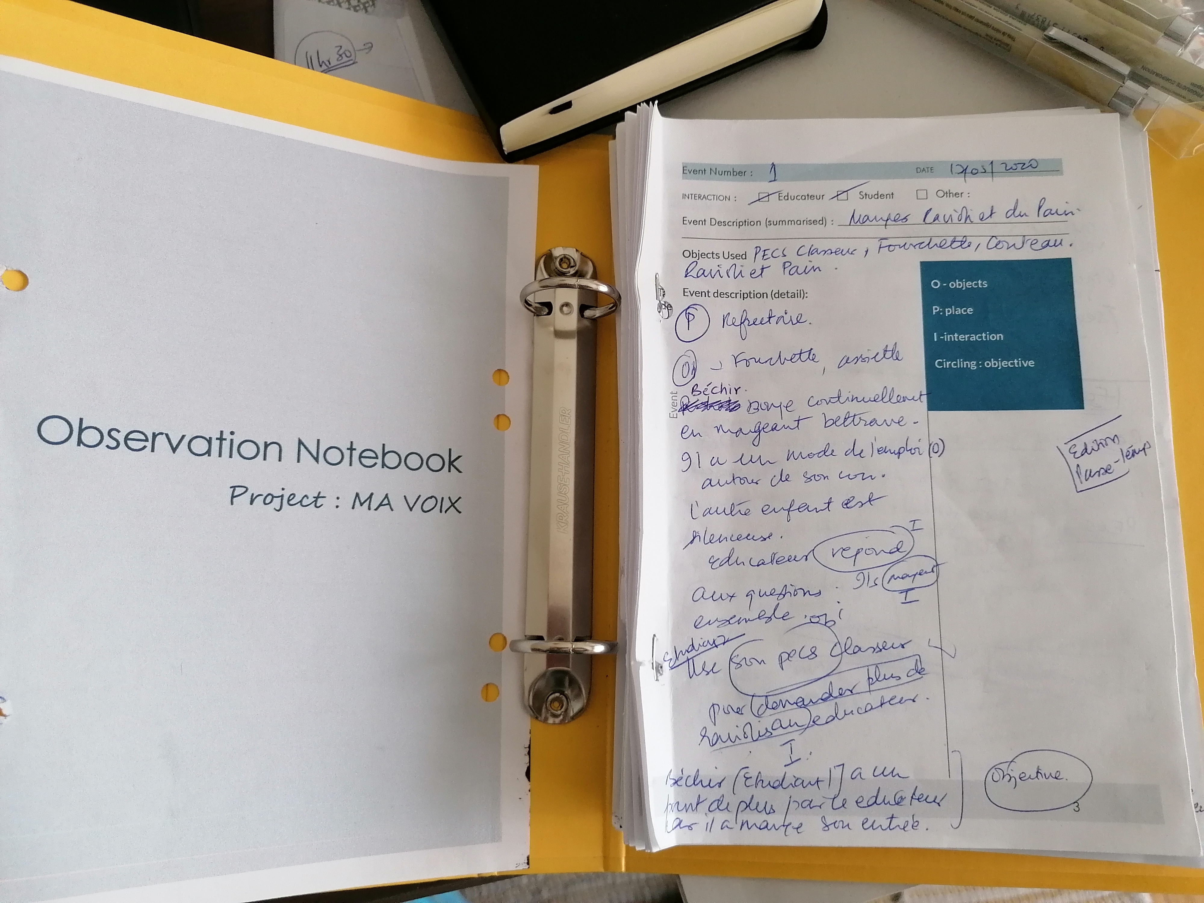
A lightweight observation framework that captures the complete story of educator - student interactions - from digital tools to body language - delivering rich, actionable insights at speed.
Designed to decode complex multi-party classroom dynamics, this instrument goes beyond surface behaviors to uncover the why behind every action. The standardized approach accelerated analysis while preserving critical contextual details, directly feeding personas, user flows, and strategic design decisions.

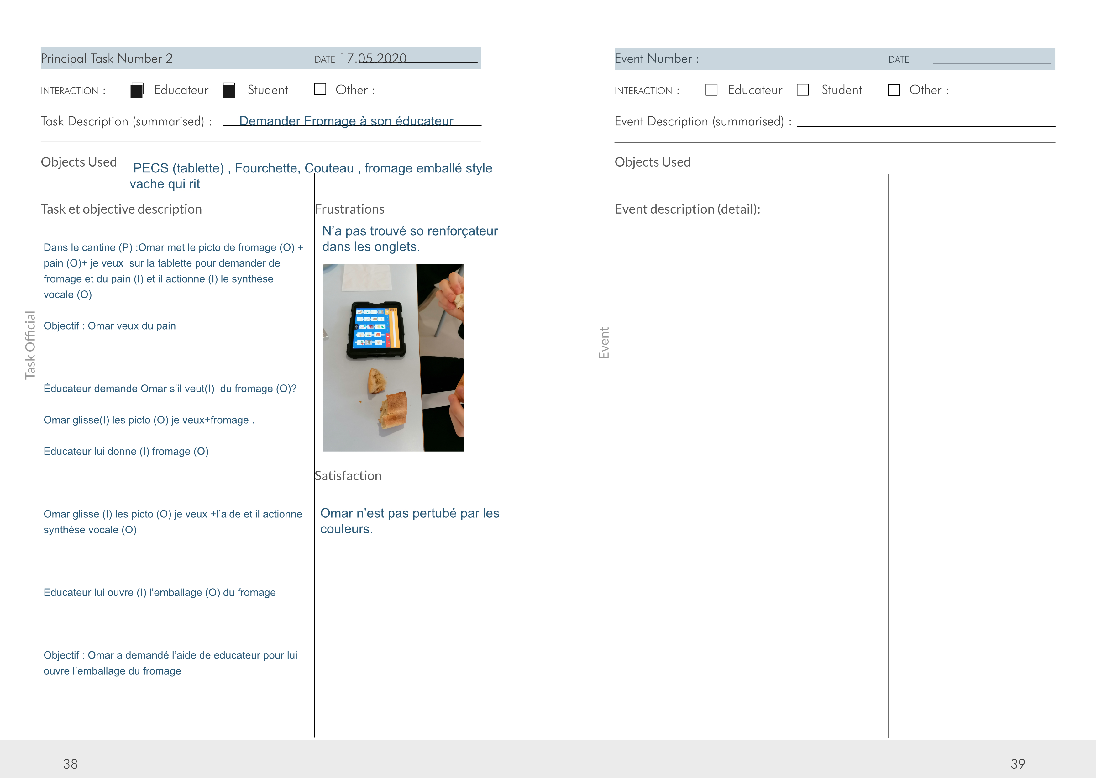
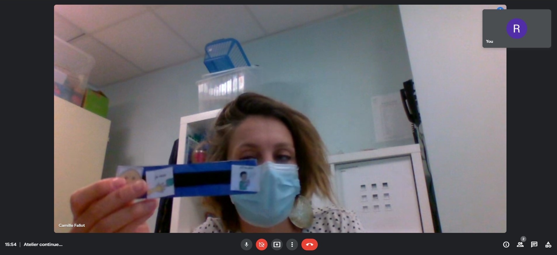
Custom observation notebook used in situ at IME.
What it is
- Lightweight, structured field-research instrument for observing non-verbal, multi-party educator–student interactions in context.
What it captures
- End-to-end interactions (steps, breakdowns, goals) across digital and non-digital tools.
- Coding by Object, Place, and the two Participants.
- The Why behind each action (intent, triggers, visible frustrations).
Why it worked
- Standardised notes enabled rapid synthesis and comparison across profiles.
- Accelerated Hierarchical Task Analysis (HTA) when contextual interviews weren’t feasible.
- Made observation sur terrain faster without losing critical detail.
Impact on the project
- Analysis was both rich and fast; outputs fed typology sheets, personas, As-Is/To-Be flows, and UI priorities.
HTA context
- A hierarchical analysis of tasks helped me understand how digital and non-digital tools are used to accomplish user tasks to reach a goal. Complex interactions (e.g., collaborative activity between four students, verbal and non-verbal) were broken into subtasks.
ex) Extract from a passage from the “Designer notebook”
- Numero de Tâche : 4
- Date : 17.05.2020
- Interaction : Éducateur – Étudiant
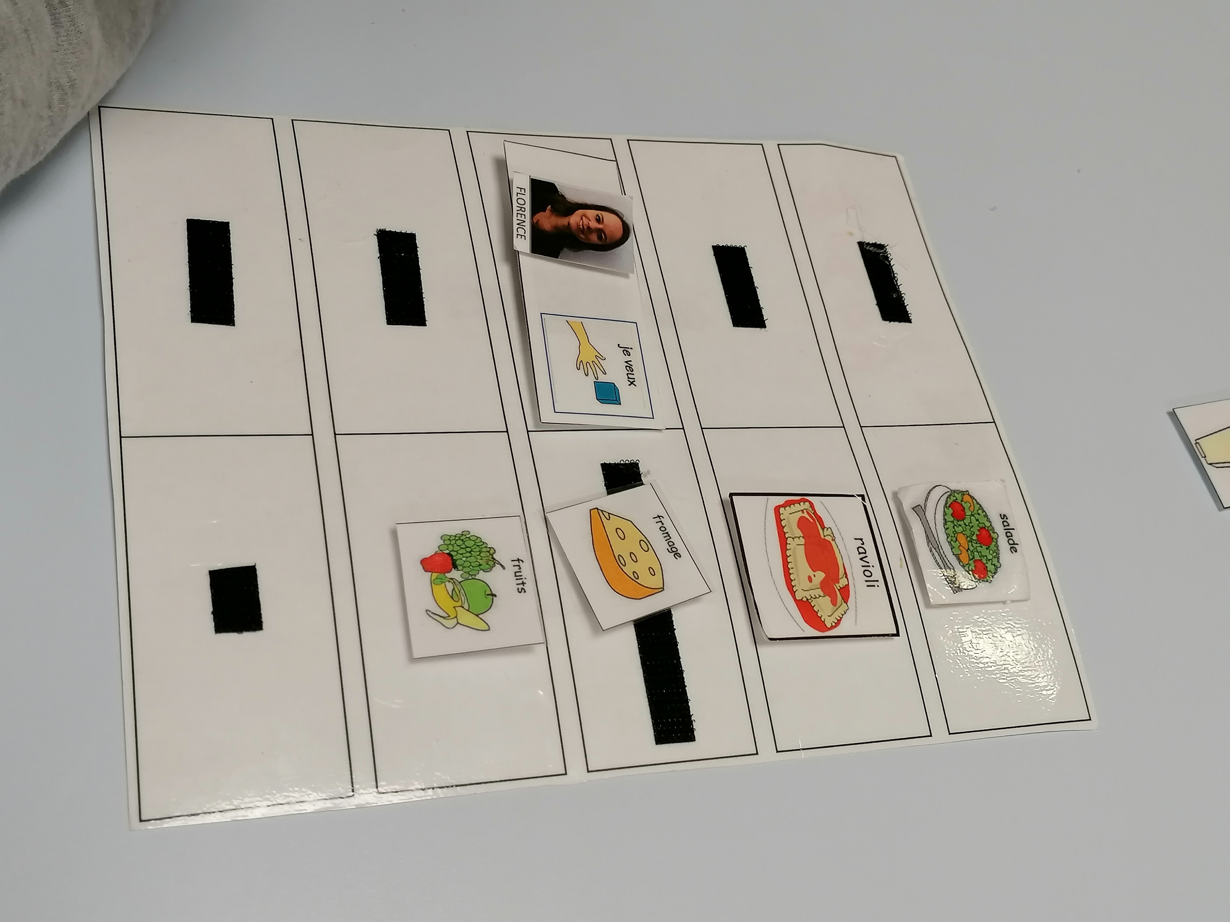
- Tâche : Demander fromage
- Obj : Picto (cartes) collées sur une bande
- L’éducateur prépare en amont sa bande (O) augmentée de communication. Les pictogrammes (o) dont Rosie aura besoin pendant le repas. Rosie met sur la bande de velcro – Pictograms (O) photo de Florence (éducateur) + picto je veux (O) + picto fromage (O) et montre (I) la bande à Florence.
Frustration : Rosie n’aime pas les échecs, face à un échec elle se roule par terre.
Key Challenges
1 – Different user abilities
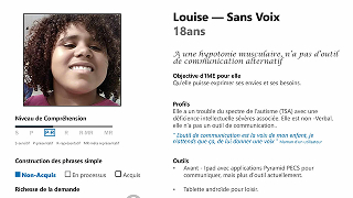
Built data-driven student profiles with speech analysts, transformed them into personas, and translated insights into design requirements—ensuring accessible requests, tailored speech synthesis, intuitive navigation, and familiar pictograms.
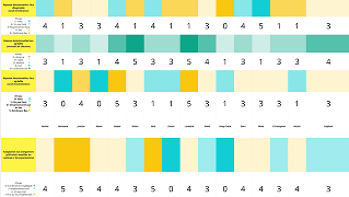
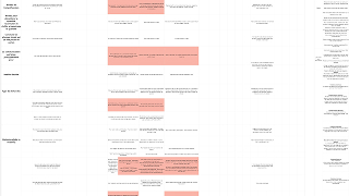
Typology datasheets mapping language, motor, and cognitive abilities,validated with speech analysts.
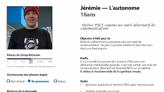

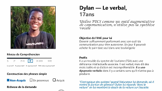
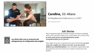
Personas representing main usage scenarios.
Description:
- Created typological datasheets for each student’s language, motor, and cognitive abilities.
- Validated profiles with speech analysts.
- Developed personas to represent the main usage scenarios.
Design requirements:
- Allow users to make requests regardless of verbal ability.
- Provide speech synthesis tailored to each profile.
- Ensure intuitive navigation with clear tab categorization.
- Give access to familiar, personal pictograms for recognition and comfort
2 – Multiple formats slowing communication
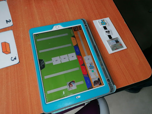
Field observations revealed how switching between paper cards and iPad apps fragmented communication flow for adolescents with ASD—leading to a unified platform design that eliminated cognitive friction.
By documenting the real-world disruptions caused by format switching, this research uncovered a critical usability barrier. The insights directly shaped platform requirements that seamlessly integrated student and therapist needs, creating one cohesive communication environment.
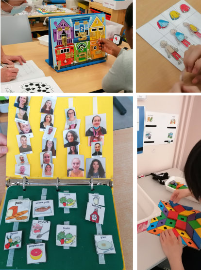


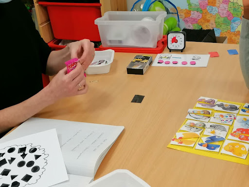
Description:
- Observed students switching between paper pictogram formats and an iPad app during activities.
- Frequent format changes disrupted communication flow and increased cognitive load.
- Documented these inefficiencies in the Designer’s Notebook.
Design requirements derived from this research:
- Integrate both user needs (adolescents with ASD) and speech therapist needs (timetable, activity charts, etc.) into the same platform.
- Provide a large, relevant pictogram library accessible directly within the app.
- Avoid forcing users to alternate between paper tools and digital devices for different tasks.
3 – Pictograms hard to maintain
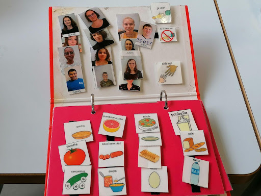
Frequent loss and reprinting of physical pictograms wasted educators’ time, driving the need for a digital system that enables quick creation, replacement, and instant retrieval.

Description:
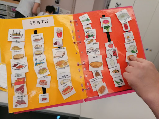
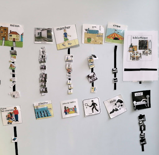
- Observed frequent loss and damage of physical pictogram cards, sometimes requiring hundreds of reprints for the same item.
- Reprinting and reorganizing pictograms consumed significant educator and speech therapist time.
Design requirements derived from this research:
- Replace fragile paper cards with a digital-first system to reduce preparation time
- Make it fast to add or replace pictograms without starting from scratch.
- Organize pictograms so they can be retrieved instantly when needed.
4 – Migration to Android prototype with navigation and visual gaps
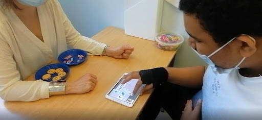
User testing showed major usability barriers—small tap targets, hidden key actions, and poor hierarchy—slowing adoption; clearer navigation, larger targets, and prioritizing essentials like the “I want” pictogram are required for independent use.
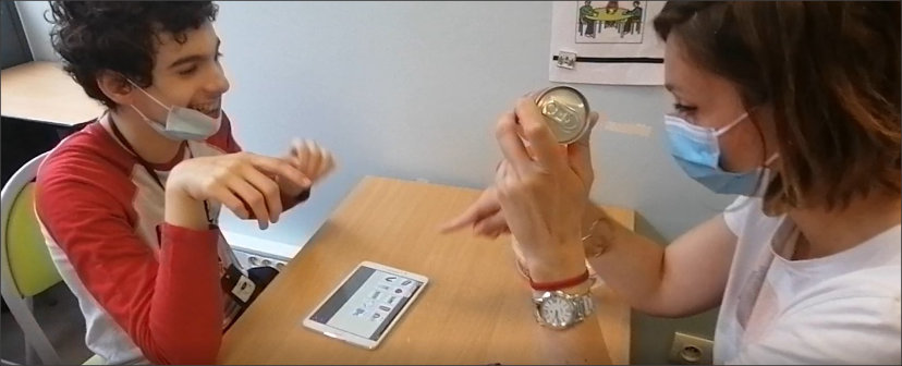
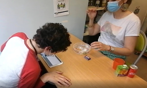

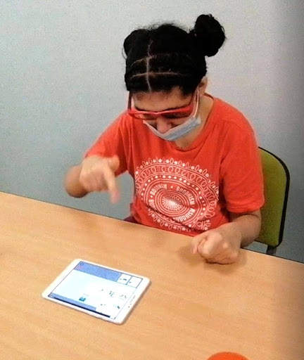
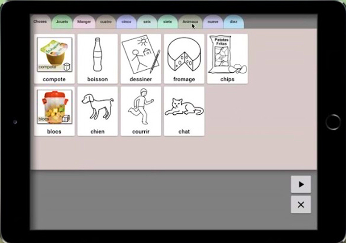
Description:
- Tested the Ma Voix Android prototype with users accustomed to the Pyramid PECS iOS app.
- Found major usability issues that slowed adoption and required heavy guidance:
- Small targets – difficult for users with limited fine motor skills.
- Hidden actions – “Start the sentence” hard to locate.
- Button priority – “Clear” more prominent than “Play,” causing accidental deletions.
- Poor cues – unclear tab navigation and weak visual hierarchy.
- Adoption had a learning curve, but after initial guidance, requests were made independently.
- Testing sample was small, so findings were indicative but not statistically representative.
Design requirements derived from this research:
- Increase tap target size for key actions (tabs, play button).
- Make essential actions (e.g., play) more visually prominent; reduce prominence of secondary actions (e.g., clear).
- Add strong visual cues for “Start the sentence” to match user mental models.
- Prioritize placement of the “I want” pictogram, the most frequently used element.
- Reduce reliance on physical/vocal guidance through clearer navigation and hierarchy.
5 – Loss of settings when device broke
Educators noted that local-only storage meant all settings were lost if a tablet broke, forcing full reconfiguration; preserving profiles independently of devices and enabling anytime, cross-device access is needed to prevent communication disruption.

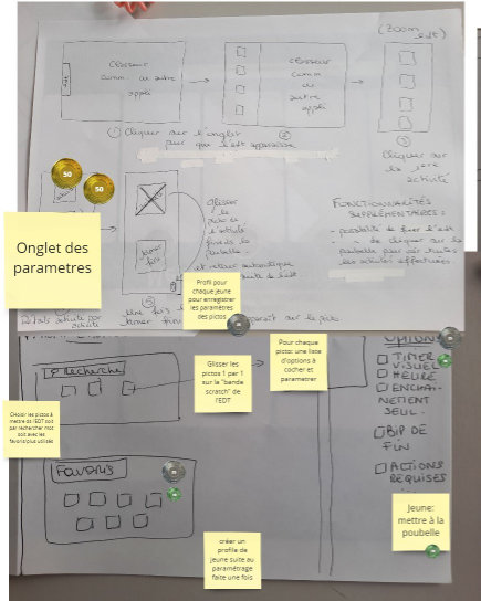
Description:
- During the co-design workshop, educators highlighted that all settings and pictogram organization were stored locally on each device.
- If a tablet broke, all customization was lost.
- Caregivers had to reconfigure the tool from scratch, causing delays and frustration.
Design requirements derived from this research:
- Preserve user and caregiver settings independently of the device.
- Allow profiles to be accessed from any device at any time.
- Prevent disruption of communication when configuration changes are made.
Solutions & Outcomes
1 – Different user abilities
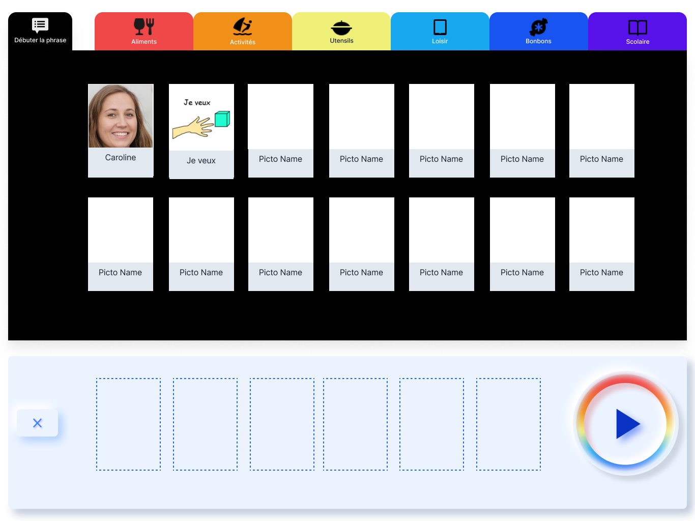
Simplified UI with larger tap targets, clear tab categories, personal pictograms, and profile-based speech synthesis enabled adolescents with diverse abilities to make independent requests and progressively build communication skills.
Solutions implemented:
- Simplified interface with large tap targets to improve usability for varying motor skills.
- Clear, visually distinct tab categories to reduce confusion.
- Integration of personal pictograms to match individual user familiarity and needs.
- Speech synthesis per profile so users hear correct sentence structure; supports verbalisation practice for those able to speak.
Outcome:
Enabled adolescents with varying cognitive, motor, and language abilities to use the tool independently, make requests without assistance, and gradually expand their communication skills.

As-Is user flow observed at IME.

Intro:
Jeremy is in the canteen for lunch and he wishes to have a steak.

2 - Multiple formats slowing communication
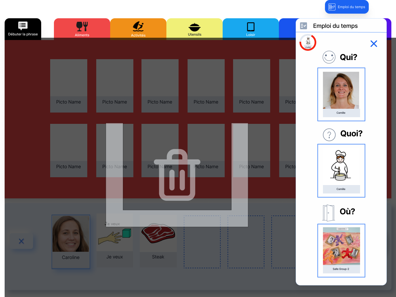
The solution centered on simplifying access to pictograms and reducing fragmentation across tools. By integrating open-source pictogram libraries and combining both communication and support aids within one application, the design provided a consistent, single digital environment.
Solutions implemented:
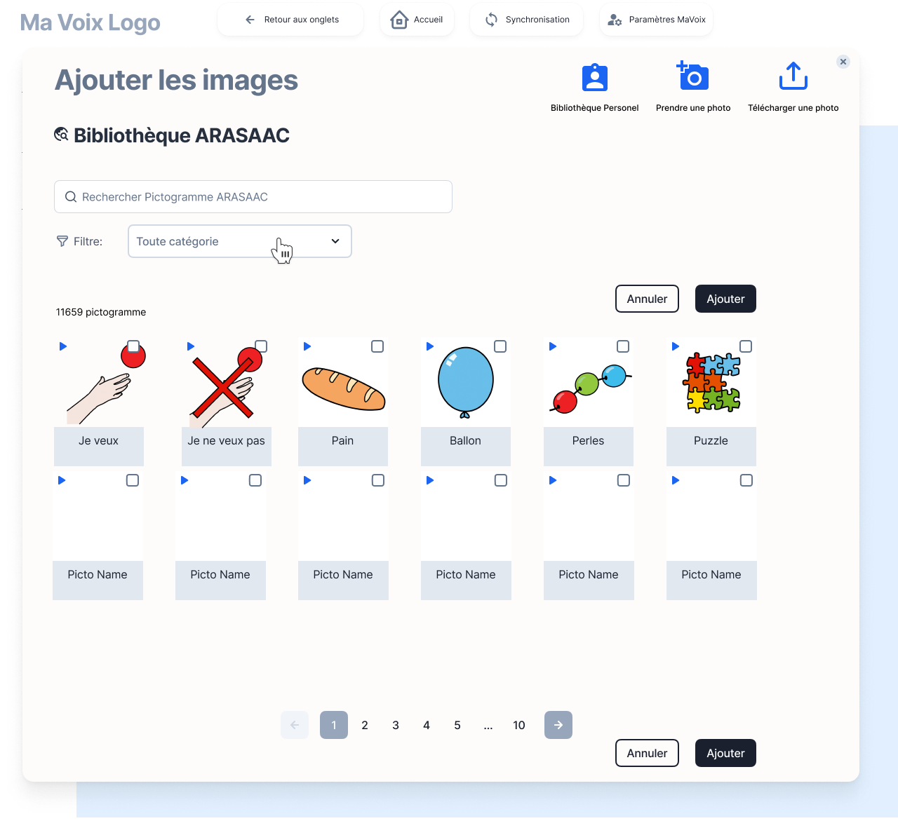
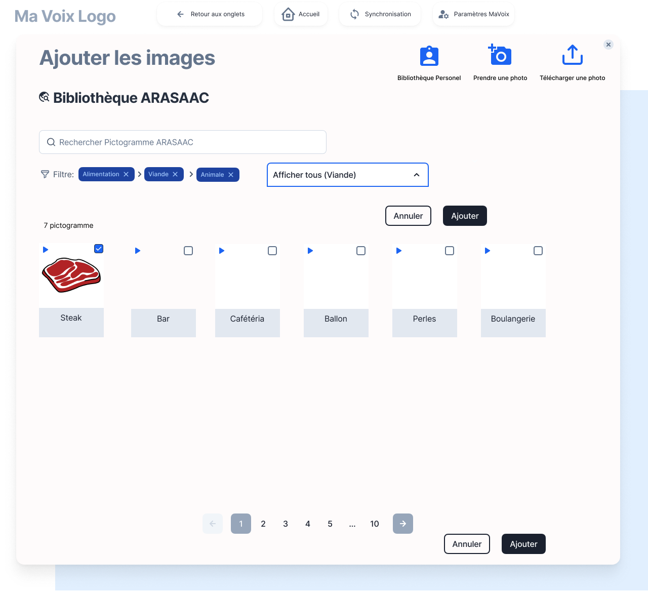
- Expanded the pictogram library by integrating open-source pictogram banks (ARASAAC) directly into the application.
- Designed the app to handle both daily communication and support tools (timetables, activity charts) in one interface, removing the need to switch between paper and digital formats.
Outcome:
- Created a single, consistent digital format for pictograms, reducing the mental effort of switching tools.

Access to open source library

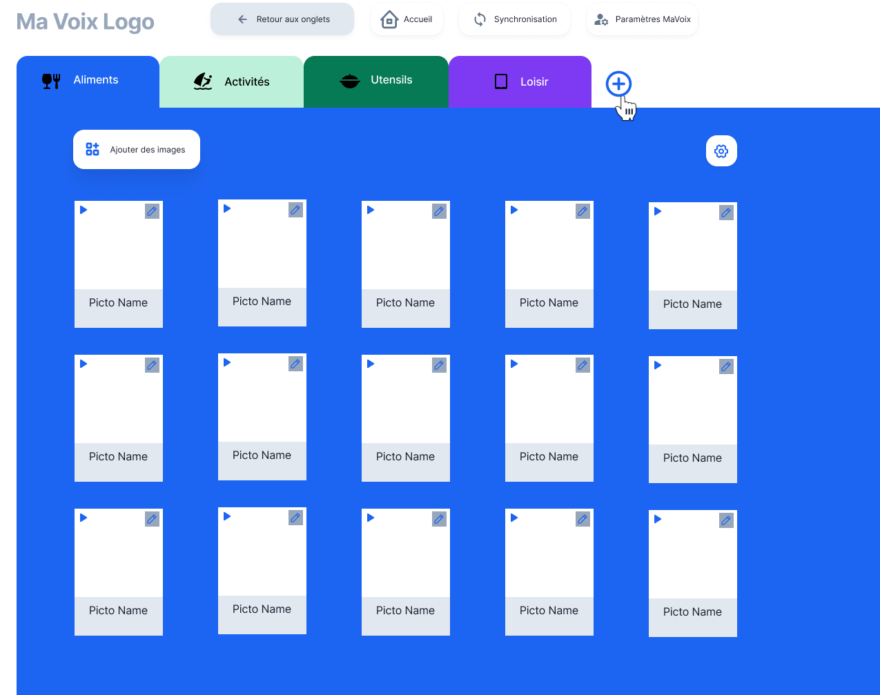
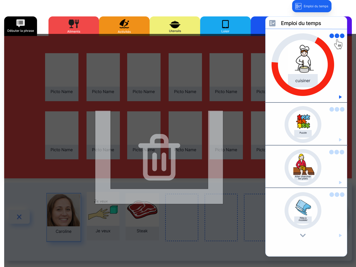
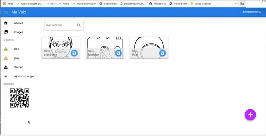
Both the care giver and the student have access to pictogrammes from their personal library and a huge open source library - ARASAAC , with more than 35000 pictogrammes.
Solution 3 – Pictograms hard to maintain
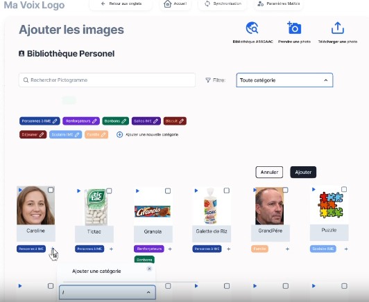
Managing pictograms was a constant challenge for the IME: assets were scattered, updates required manual reprinting, and personalization was slow. To address this, we designed a centralized digital library that organizes, personalizes, and retrieves pictograms instantly, ensuring they remain the living core of both daily communication and institutional support.
Solutions implemented:
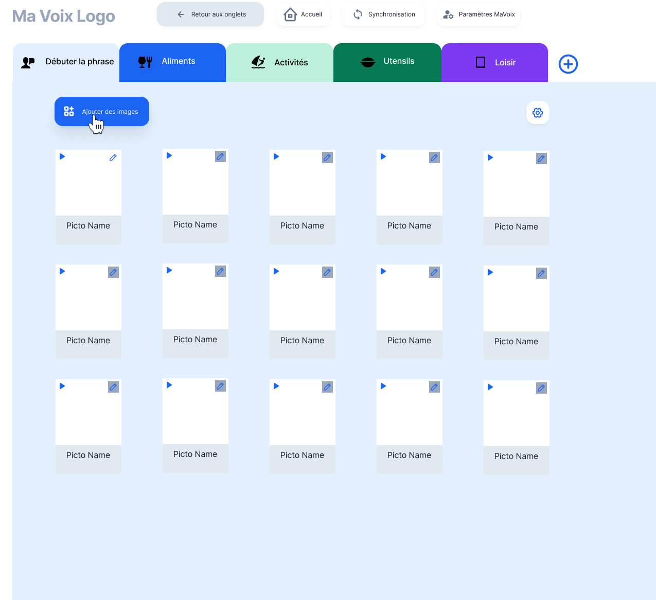
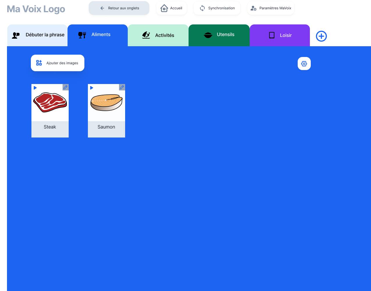
- Developed an integrated pictogram management system to centralize all assets digitally.
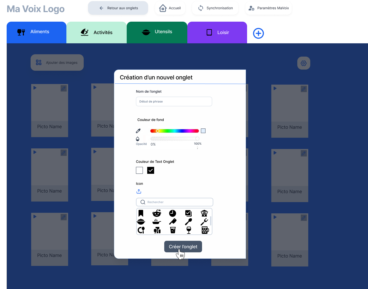
- Added multi-tag categorization and theme grouping to speed up organization.
- Enabled direct import from camera, computer, or open-source pictogram banks for quick replacement.
- Built a search function to instantly find pictograms, eliminating manual reprinting
Outcome:
- Created a digital pictogram library with tagging, personal pictogram support, and integrated search to simplify maintenance.
Pictogram gallery
The pictograms are the central elements of the system and of the IME. They are either chosen from an image bank (such as ARASAAC, Pyramid PECS) or they are personalised.
Solution 4 – Migration to Android prototype with navigation and visual gaps

During testing, users struggled with small touch targets, unclear navigation, and hidden actions that slowed adoption. The redesign focused on improving accessibility and visual clarity, making the interface more intuitive and reducing reliance on caregiver guidance.



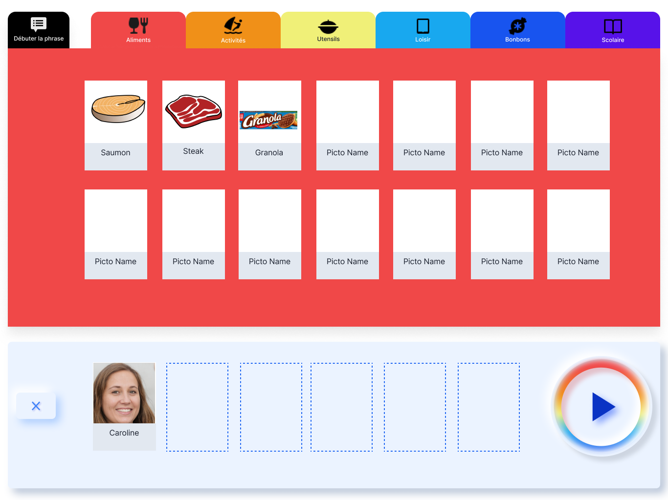
The improvements made with the New Screen
Post two rounds of user testing
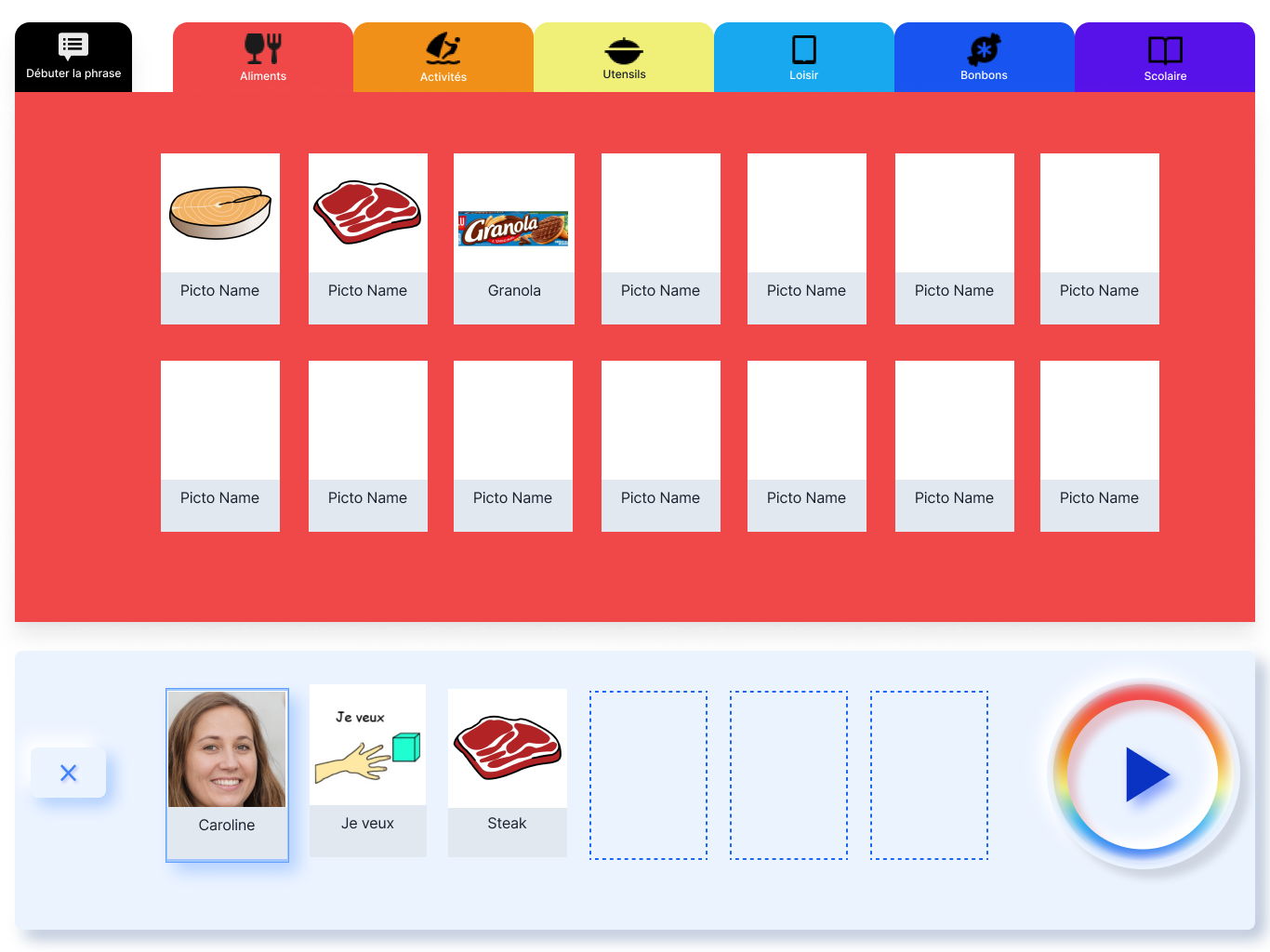
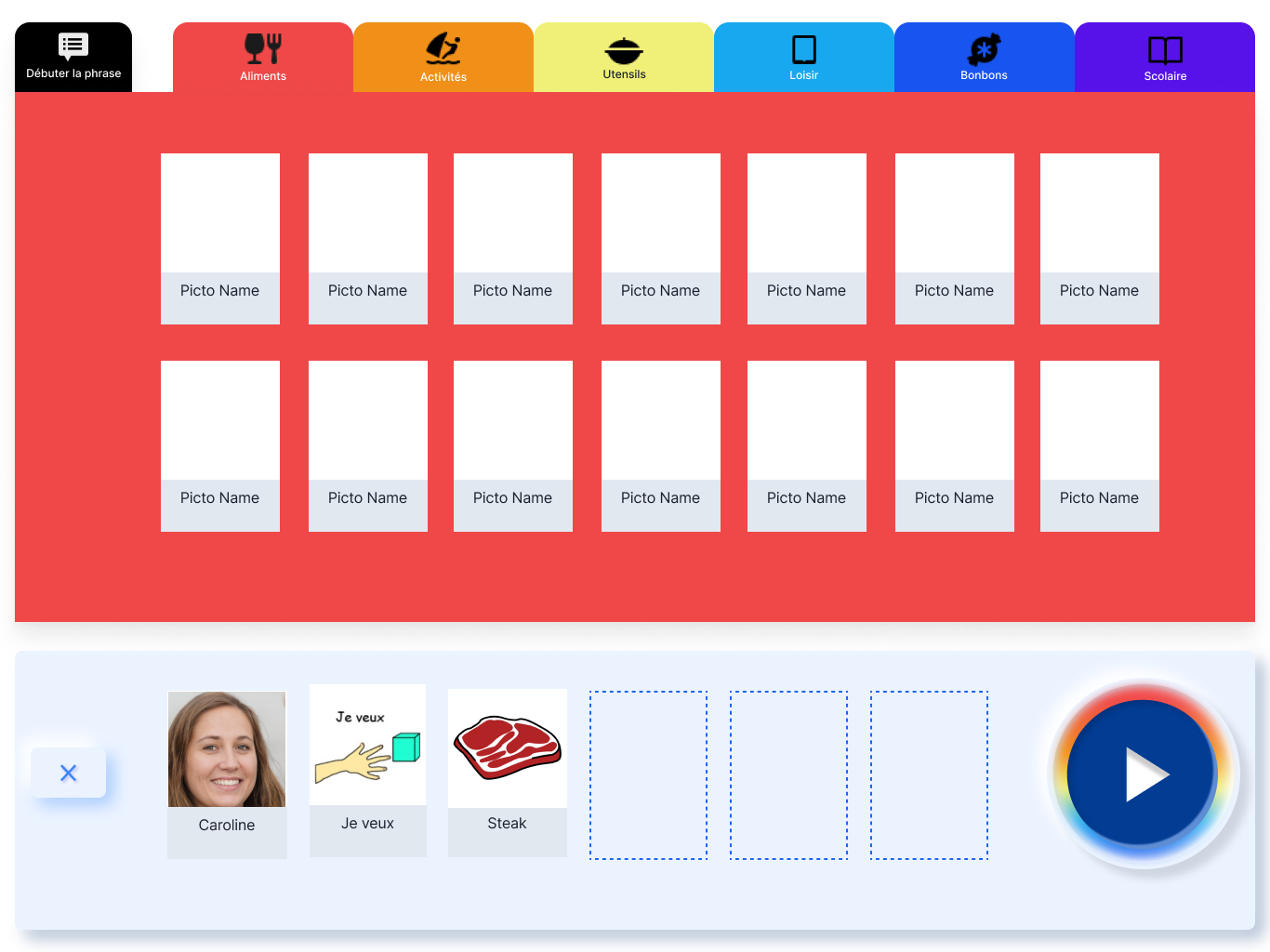
| Old Screen | New Screen |
|---|---|
| Tabs were too narrow, making selection difficult for users with limited motor skills. | Tabs widened and color-coded, improving hit area and visual differentiation between themes. |
| “Start the sentence” was visually indistinguishable from other tabs. | “Start the sentence” emphasized with spacing and color hierarchy, reinforcing its foundational role. |
| Play and Clear buttons looked identical (same size, stacked), causing accidental deletions. | Play button enlarged, visually differentiated from Clear, and given higher contrast to reduce errors. |
| Pictograms were mixed together without categorization. | Pictograms structured by category (e.g., caregiver names, “I want”), enabling quick retrieval and encouraging use. |
| No affordance indicated that a sentence strip should be built at the bottom; pictograms were simply draggable. | A dedicated sentence-building zone with dotted guides and hover feedback signaled placement, strengthening affordance. |
5 – Loss of settings when device broke

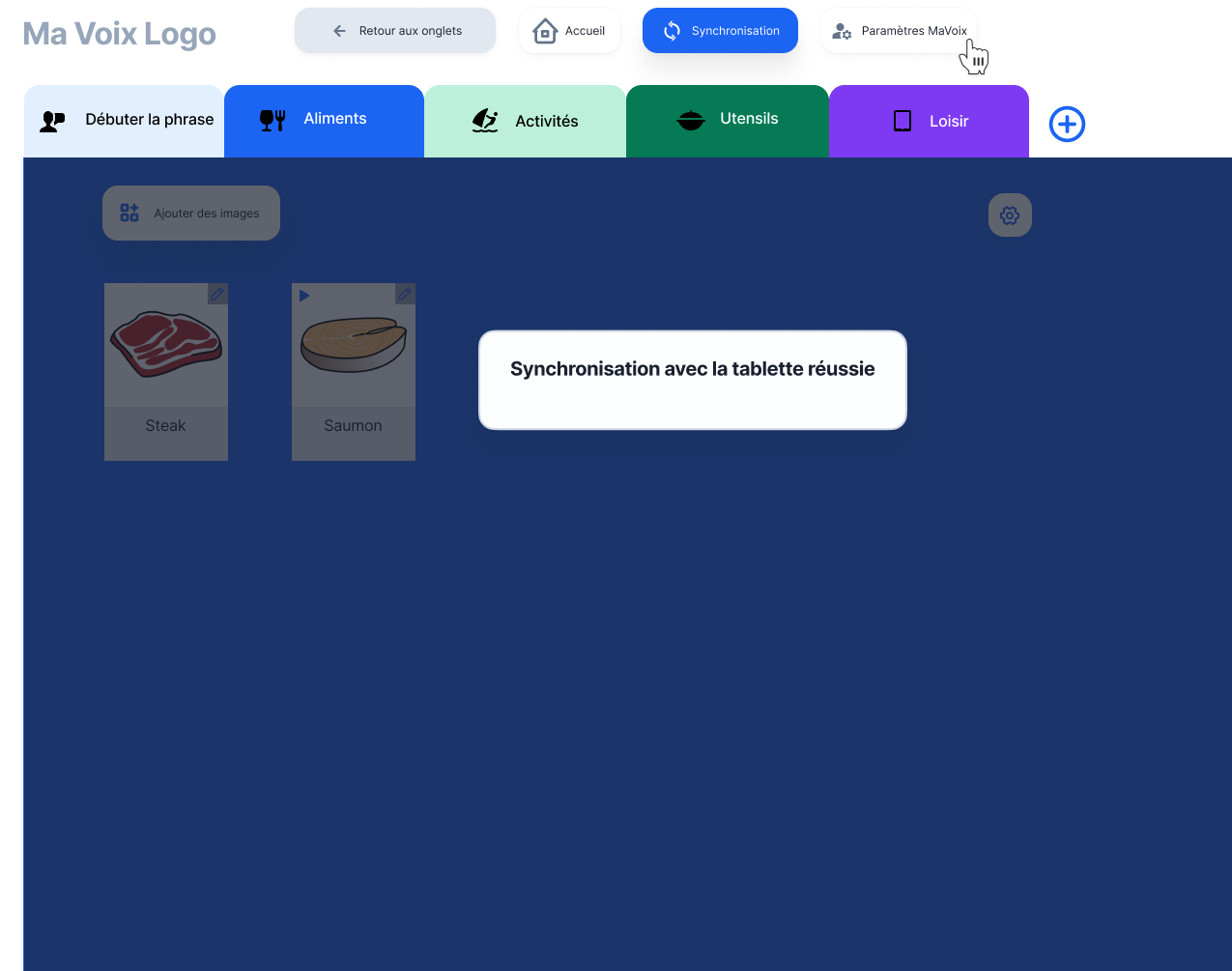
One of the main pain points uncovered was the fragility of local storage: if a tablet broke, all customizations and pictogram setups were lost. The solution focused on ensuring continuity and stability by introducing cloud synchronization and separating caregiver and user environments, so communication could remain uninterrupted while settings were managed in the background.
Solutions implemented:
- Cloud synchronization for all settings and pictogram organization, eliminating data loss from device damage.
- Split interface separating the caregiver’s configuration environment from the user’s communication interface, so adjustments can be made without interrupting communication.
- Single account login to synchronize and manage both parts of the application across devices.
Outcome:
- → Eliminated the risk of losing configurations due to device failure and allowed instant restoration on any replacement device.
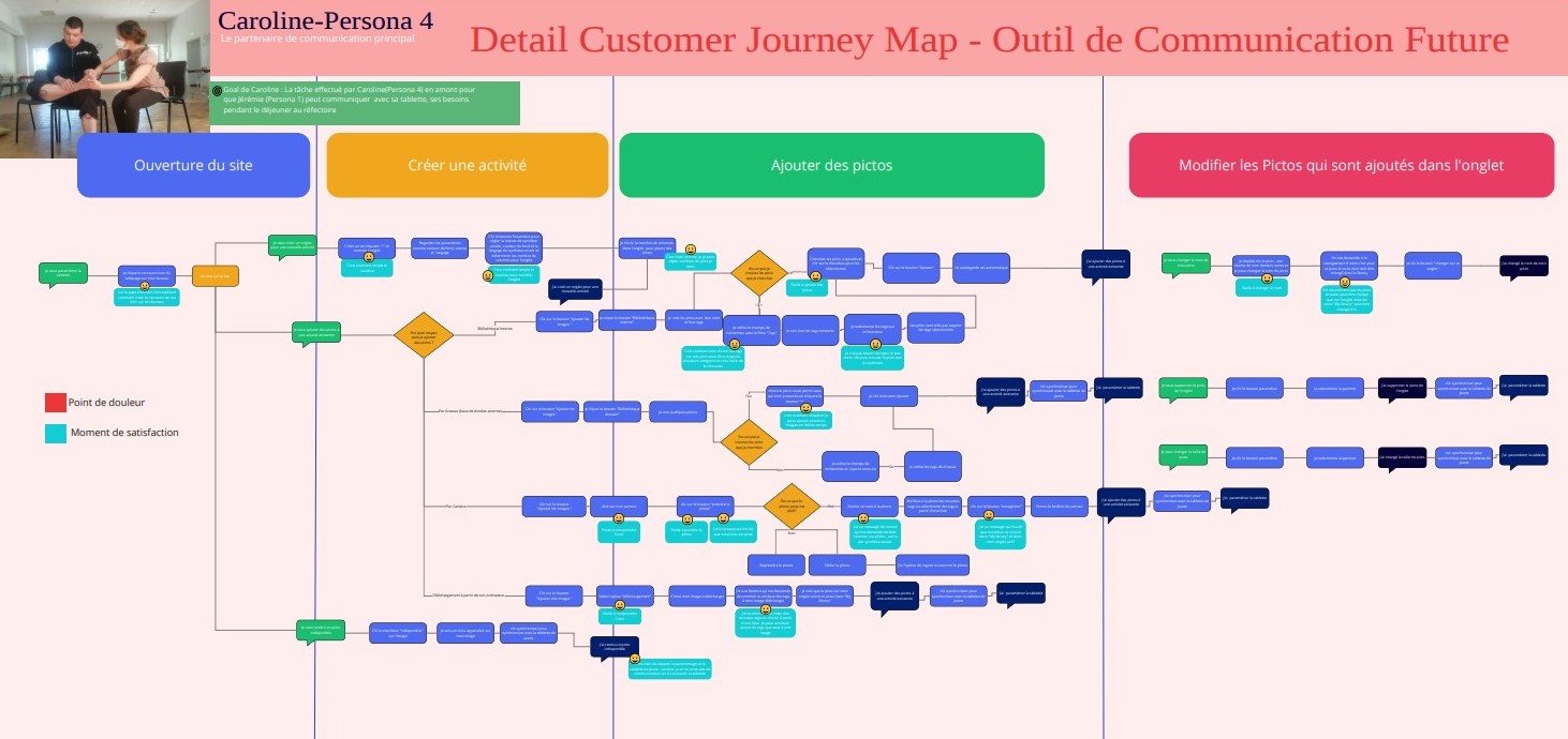
Future user flow for the caregivers.
Intro:
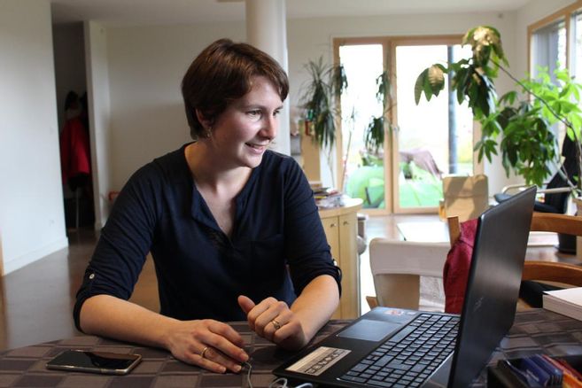
Caroline (Persona 4) - speech therapist/educator
Caroline has just entered the office in the morning. She decides to create a new tab on her PC and place appropriate pictograms so that Jeremy (Persona 1) can use his tablet in the canteen during lunch.
