Context

Before we touched the navigation, Intermarché’s promotion engine was losing momentum on-line while a regulatory time-bomb ticked in the background:

Project Goal

UX Mandate

Transform the hidden, poorly performing promo sections into first-class entry points and enable one-click “add to cart” inside the digital prospectus so shoppers stay in flow and baskets grow.

My Role & Key Actions

My Role & Key Actions (Lead UX Designer)
UX Phase Key Action Collaborators Result
Diagnose -Audited GA & ContentSquare funnels
- Quantified hidden-menu leak & 93.9 % exit-rate
Data Analyst Identified two “money leaks”, secured green-light to prototype
Ideate - Re-mapped header into “shopping left / account right” zones
- Sketched dual “leaflet vs catalogue” views
- Hi-fi nav prototype ready in 3 days; 4/5 test users preferred new nav
Testing & ideate -Ran 5 guerrilla usability tests in the store
- Tweaked layout
- Reduced task time (find & add promo) from 73 s → 21 s
Launch & Track -Coordinated A/B release
-Monitored live KPIs; shared daily Slack snapshot
Data Analyst Week-1: click-through × 3, exit-rate ↓ –85 pp, adds / view +31 %

Results

Metric Before (2 Feb → 11 Apr ) After(3 → 11 May ) Δ (absolute)
Exit-rate 93.9 % (726 K exits) 8.2 % -85.7 pp
Products added per view 1.6 2.1 +31 %
Avg. time on prospectus page - 2 min 16 s -
Prospectus ranking in “boutiques” - 3rd (18K views) ↑ ranking

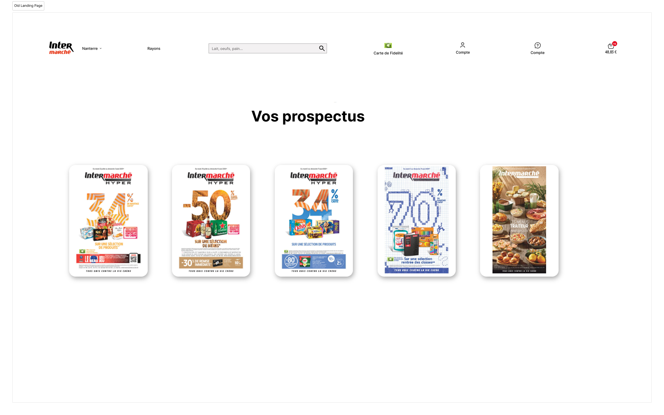
Key Challenge 1 – Discoverability

Old Navbar

Illustrative wire-frame hidden links drew only, 2–3 % of sessions (GA audit, Feb–Apr ’23)

New Nav bar

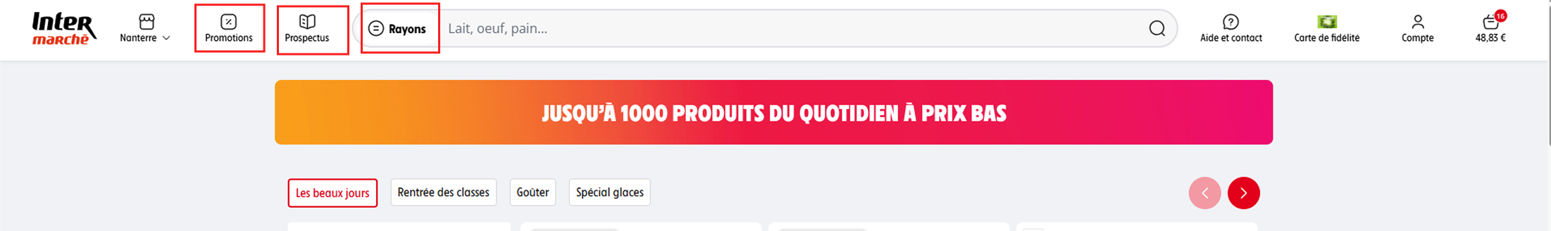
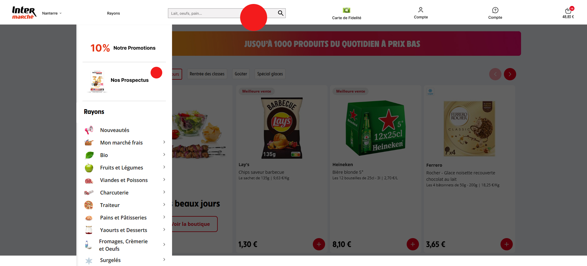
New Nav Bar - shopping menu items on the left and user account and fidelity on the right

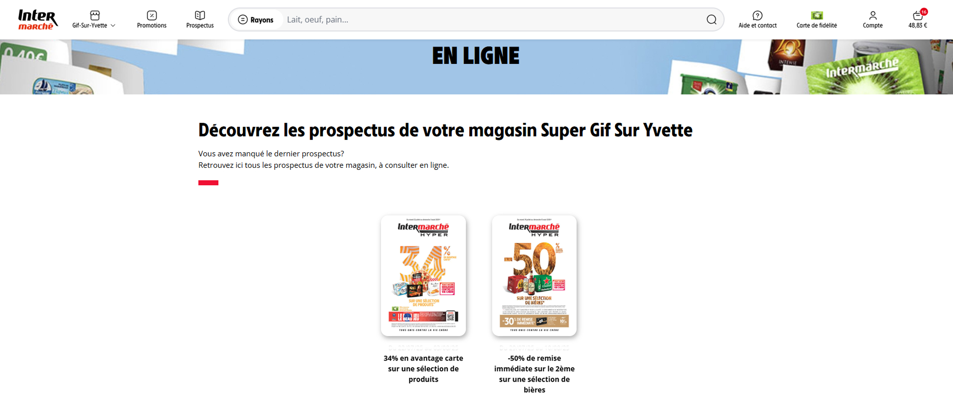
Action – Moved Promotion & Prospectus to the primary nav, left of the search bar.
Outcome – Click-through roughly tripled; prospectus became the #3 “boutique” with 18 K views in week 1.

Key Challenge 2 – Shoppable, Store-Specific Prospectus Before the Print Ban

Before. The prospectus landing page dumped every leaflet in one place, unfiltered by Point de Vente. Customers had to hunt for the right store edition, and even then the leaflet was read-only; adding promo items meant memorising SKUs and starting a new search.

Old prospectus page

Why this failed

  • All stores mixed — five look-alike leaflets; users can’t tell which one applies.
  • Read-only flipbook — no in-leaflet add-to-cart, forces a search detour.
  • 93.9 % exit rate — GA snapshot (Feb → Apr).
New store-filtered prospectus boutique

After

Store-aware entry. The top-nav link now drops users straight into a Boutique Prospectus pre-filtered for their selected store.

GIF showing toggle and add-to-cart inside leaflet

    After

  • Dual view. Shoppers can toggle between a familiar “paper” flipbook or a grid catalogue.
  • Flipbook now lets shoppers add items in one click.
  • Flipbook → Catalogue → “Add +” — the grid appears and the hover state shows items can be added straight to the basket.

Key takeways

Worked well :