Frame & Align
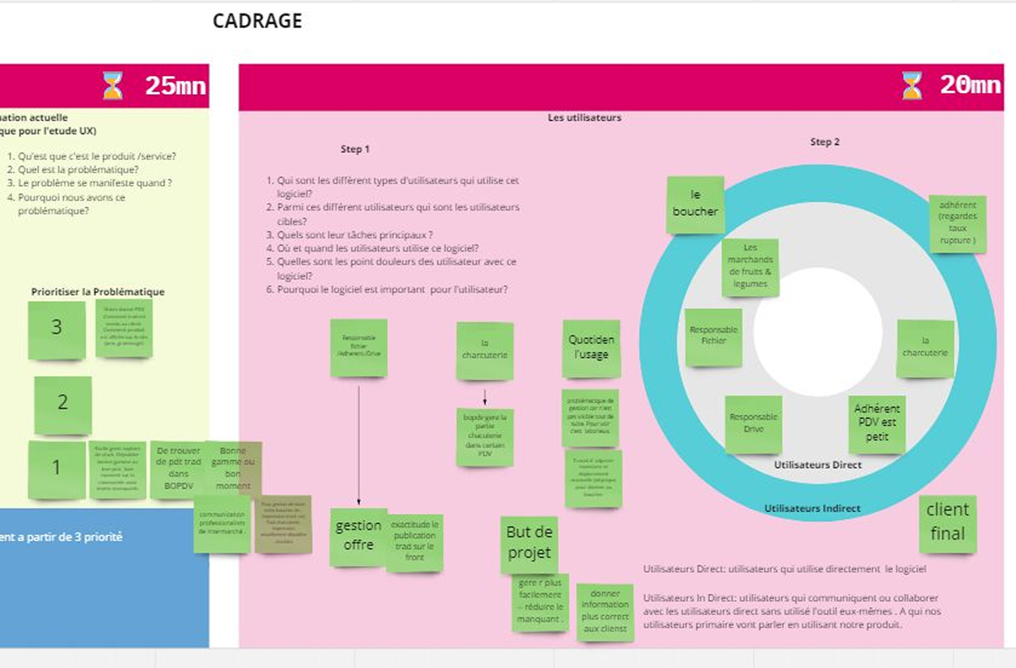
Alignment & Scoping Workshop with PM, Business Owner, Responsable Animation Commerciale.
Output – understanding the target users, different stakeholders to be interviewed and observed, the project scope and KPIs
Observe & Interview

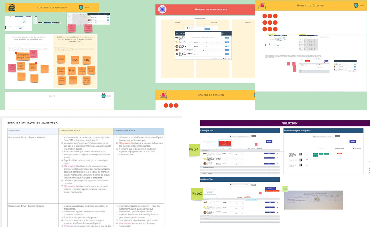
Synthesis & Hypothesise
Some primary insights are:
-
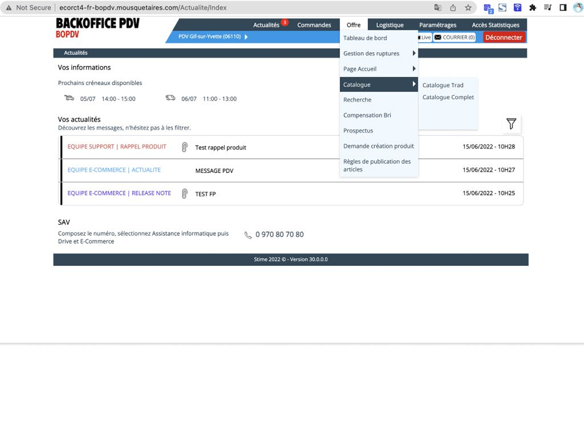
Split “Trad” vs. “Complet” catalogues
Users struggled with one massive EAN list—so so I added two dedicated entries, guiding them straight to the products they manage. -
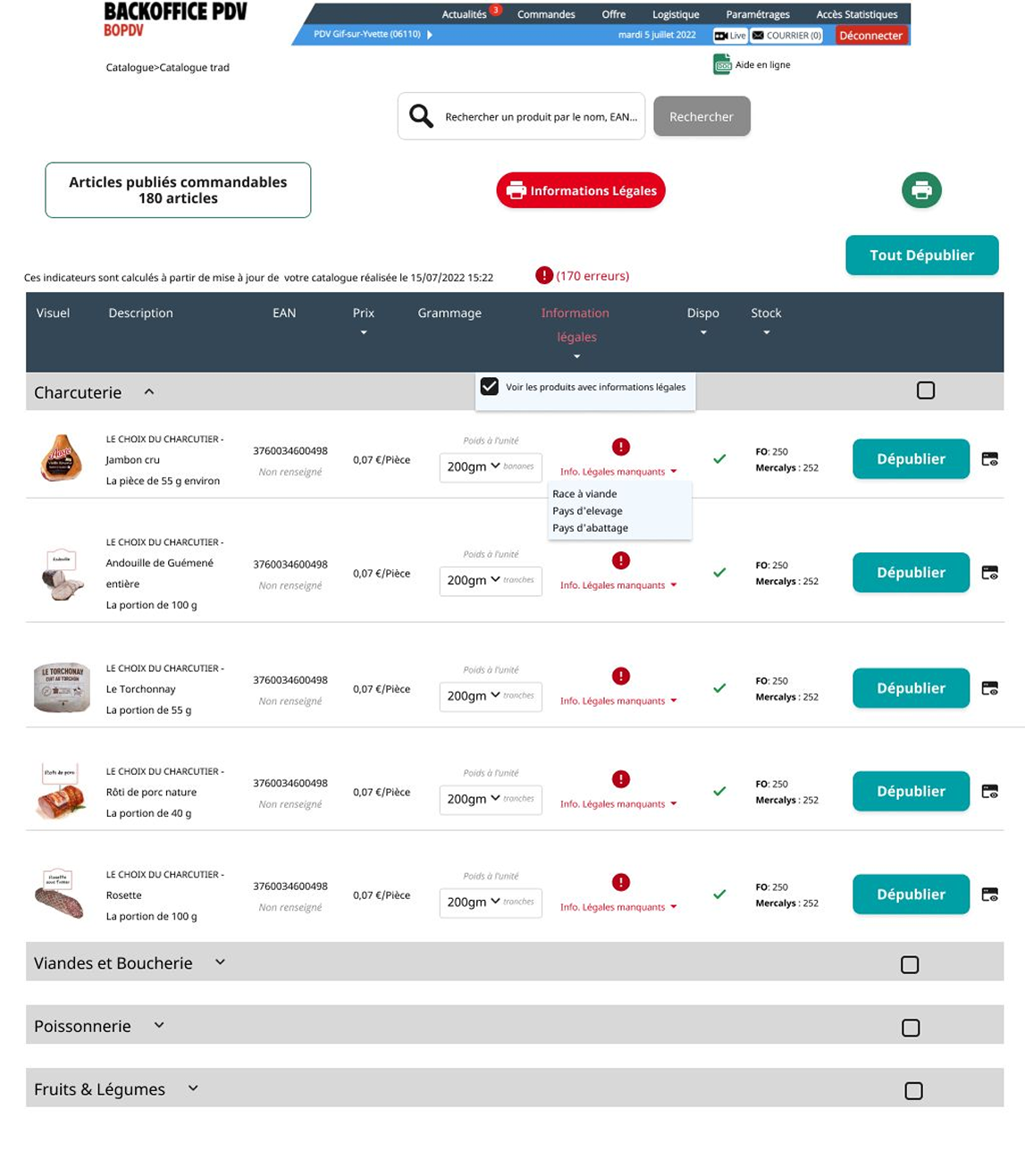
Surface legal-info gaps
Essential fields (élevage, abattage, origine) were hidden, forcing manual checklists. I added a “Legal Info” column with per-EAN flags and a one-click filter. -
Standardise weight units
Inconsistent slice/kilo rules led to order-prep mismatches. After a long discussion a unified “Poids de l’unité” with a 200 g minimum, aligning both stand managers and customers.