Testing AI Design Tools While Solving Real Problems
Date: Septembre 2025 – Septembre 2025
Duration: 1 week
Role: UX/UI Designer (Personal Project)
Tools:Figma, ChatGPT, Claude, Uizard, Visily, Make Design System, Lovable, Build.io
Context
AI design tools are everywhere. Promises of 10x productivity. Revolutionary workflows. But which ones actually work?
Rather than theorize, I decided to test them systematically across an entire design process - from concept to interactive prototype. Not with a fictional brief, but while solving a real problem: helping people avoid overdrafts when managing multiple financial commitments.
The real question: Where does AI genuinely accelerate design work, and where does it just create more work?
Scope
Read-only budgeting + subscription detection (PSD2 AISP). No money movement.
Markets:EU/France.
Assumptions:Bank data via licensed aggregator; advisory insights only.
What’s out of scope:Lending, investing, in-app cancellation, card issuance.
Design Problem
I identified a pain point affecting many adults aged 25–45: managing payments scattered across multiple platforms.
The scenario: You have Netflix, Spotify, and Disney+. You're paying off a laptop in 3 installments and a coat in 4. Different dates. Different merchants. No consolidated view. Then payday hits, everything charges at once, and you're overdrawn. Design challenge : How might we reduce overdraft risk for users managing multiple recurring financial commitments?
Understanding the Problem Space
Visibility gaps - no overview of total commitments, subscriptions scattered everywhere, unclear remaining balance
Timing chaos - misaligned due dates, payments clustering in the same week, uncertain BNPL end dates
Decision paralysis - can't prioritize when money's tight, underestimate small recurring amounts, gnotification that arrive too late
Management friction - high effort to cancel subscriptions, discovering overdrafts after the fact, abandoned manual tracking attempts
Root causes - information lives in emails, apps, and statements. Poor signaling of approaching risk. Complex cancellation flows.
The Experiment: AI Across the Design Pipeline
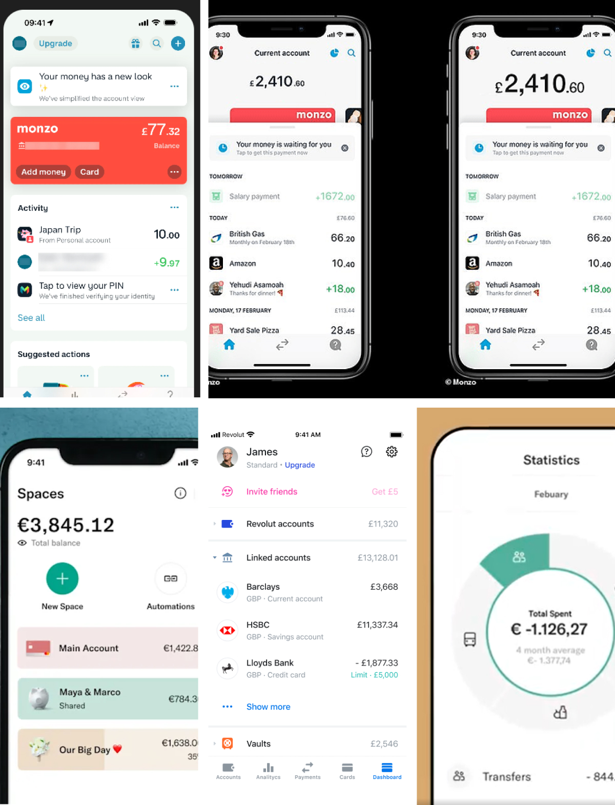
I benchmarked UI patterns across Revolut, Klarna, Monzo, Rocket Money, and Floa - examining dashboards, subscription flows, alerts, and payment schedules. This informed the design requirements:
Design requirements: Consolidated view of all commitments
Total spending overview with "remaining funds" visibility
Proactive alerts at critical moments
Simple language, clean interface
With the problem framed, I had everything needed to test AI tools across the full design process.
The Experiment: AI Across the Design Pipeline
This became my testing ground. Every stage, I documented what worked and what didn't.
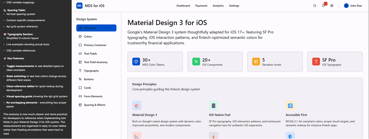
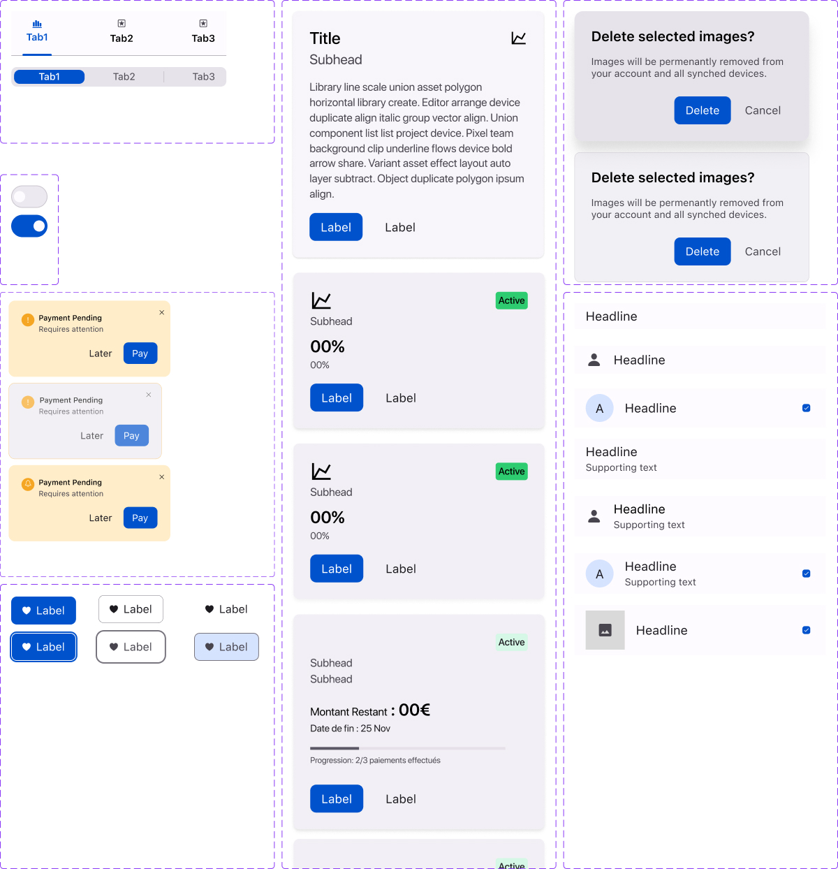
Stage 1: Design System Foundation
Tool tested: Make Design System
Approach: Generate initial system, then formalize manually in Figma
Key decisions:
SF font for cross-platform consistency (validated reasoning with ChatGPT)
iOS icon set as default
Manual color palette, text hierarchy, design tokens
Verdict: AI design systems are excellent starting points but need human refinement for consistency and accessibility. Saved approximately 3 hours on initial setup.
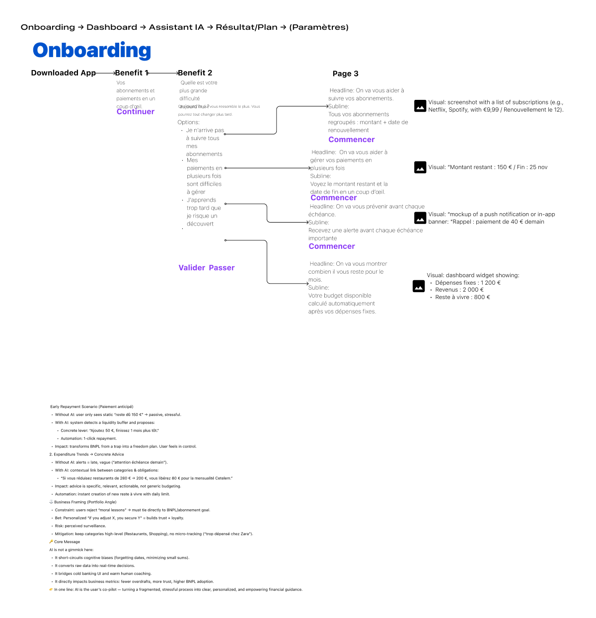
Stage 2: User Flow
Tools tested: ChatGPT and Claude
Approach: Conversational brainstorming for IA structure, user flows, navigation patterns
Developed:
Onboarding to dashboard journey
Core navigation structure
Payment management workflows
Verdict: AI excels at generating alternatives and surfacing edge cases I missed. The dialogue format forces more thorough thinking than solo work. Claude slightly better for structured reasoning.
Learning: Use AI as thinking partner, not oracle. Question its suggestions. Push back. The conversation is where value lives.
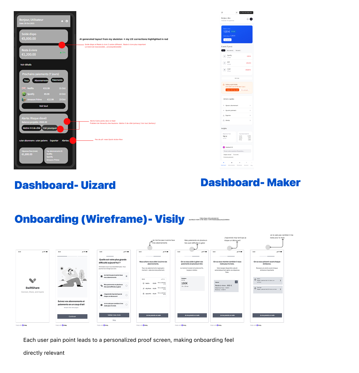
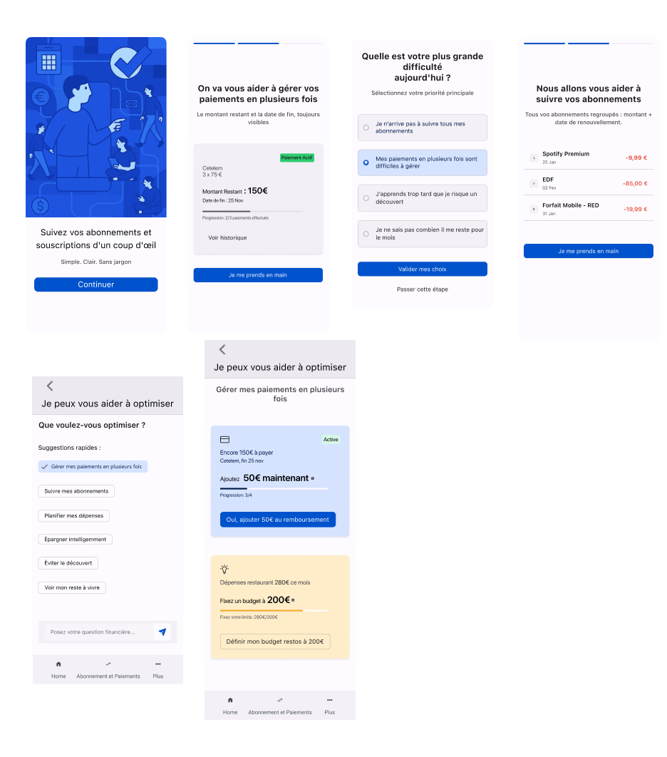
Stage 3: Wireframing Tool Showdown
The test: Uizard vs. Visily & Make
I created identical wireframes of dashboard in Uizard and Make and other wireframes in Visily, then compared output quality and efficiency.
Needed to create different files for the different pages
Best of the three. No use passing though the lo-fi wireframe
Learning: Not all AI tools are created equal. The quality gap was substantial enough to impact entire project timelines. Tool selection matters as much as skill.
Stage 4: High-Fidelity Design
Components - Figma
Screens- Figma.
Tools tested: Make + Build.io plugin + Manual Figma
Hybrid approach:
Generated dashboard variations in Make
Imported to Figma via Build.io
Manually refined to match design system
Strategic decision: Created key screens with clean autolayout and components entirely by hand to establish a vision inorder to prepare detailed prompts for prototyping.
Learning: Optimal workflow combines AI speed with human precision. Use AI for exploration; humans for quality control and strategic screens.
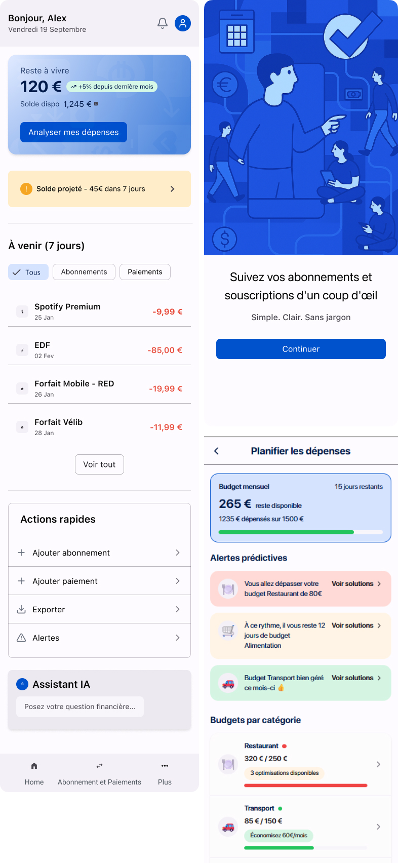
The strategic opportunity:While building the prototype, I identified a critical gap in the competitive landscape. Existing apps consolidate financial data but provide zero personalized recommendations. They show you the problem but don't help you solve it
Product strategy shift:Leverage AI not just as a design tool, but as a core product differentiator. Transform passive financial tracking into proactive financial guidance
Using ChatGPT for product strategy:going beyond nudges and notifications
Brainstormed AI-driven features that deliver genuine user valuegn system
Generated realistic mock user data for contextual scenarios
Felt overpowered for mock-data design prototypes
Designed conversational flows that feel helpful, not intrusive
Three strategic AI capabilities:
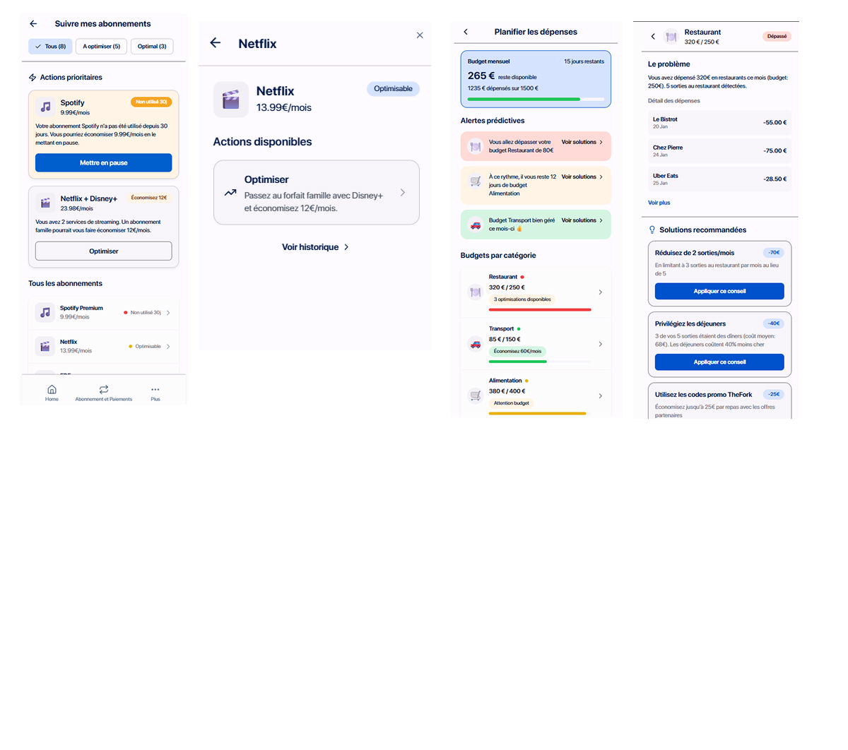
Gérer mes paiements en plusieurs fois — Intelligent payment prioritization when budgets are tight
Suivre mes abonnements — Proactive identification of unused subscriptions draining accounts
Planifier mes dépenses — Predictive cash flow analysis with actionable recommendations
Experience the working application built with Lovable. Click below to interact with the full prototype.
Built with Lovable • Full interactive experience
Learning: Lovable was ideal for this phase—not just for visual prototyping, but for testing complex AI interaction patterns. Its strength isn't making static mockups; it's building functional experiences that demonstrate product value.
This revealed AI's dual role in modern product development: as a design accelerator AND as a strategic feature that creates competitive advantage.
In a real case scenario:
Open-banking: Access via PSD2 APIs through an ACPR-authorised AISP; this demo never sees or stores credentials.
Scope: Read-only budgeting and subscription detection. No money movement.
Consent: Access is time-limited by law; users re-confirm to keep syncing.
Insights: Advisory only; users can correct or dismiss.
SEPA: Refund rights—8 weeks (no questions) / up to 13 months if unauthorised.
Cancellation: Fluxia would deep-links to the merchant; France’s “3-click cancel” applies where supported.
Automated decisions: None with significant effects; human review available.
Privacy: Users can export or delete their data at any time.
What Actually Works: AI in Design
Where AI Adds Real Value
Exploration velocity — AI generates alternatives faster than humans can sketch. Use it to explore more options in less time.
Edge case detection — Conversational AI catches scenarios one might miss. The dialogue format forces comprehensive thinking.
Foundation building — Design systems, initial wireframes, structural templates. AI handles setup work efficiently.
Where Humans Remain Essential
Quality judgment — AI output needs human refinement to meet professional standards. Every time.
Strategic direction — Brand alignment, emotional tone, UX strategy require human judgment rooted in context.
Nuanced decisions — Accessibility considerations, cultural sensitivity, contextual appropriateness need human oversight.
Integration — Combining outputs from various tools into coherent design requires human orchestration.
Integration — Combining outputs from various tools into coherent design requires human orchestration.
The Pattern That Emerged
Not AI replacing designers. AI augmenting designers.
The most effective workflow:
AI for speed, exploration, variations
Human for strategy, refinement, quality
Validation against design principles and user needs
Tool selection based on task, not hype
The Real Takeaway
The future of design isn't about choosing sides—AI or human. It's about strategic integration.
The designers who will thrive aren't those who resist AI or adopt everything blindly. They're designers who:
Critically evaluate tools rather than following hype
Understand where each tool genuinely helps versus creates overhead
Maintain human judgment for strategy and quality
Build workflows that amplify creative thinking
This project proved: Understanding tool strengths and limitations is now as important as mastering design principles.
What I Built
Beyond the learnings, this project produced:
Documented workflow — Replicable process for testing AI design tools
Tool comparison framework — Systematic evaluation criteria for emerging tools
Evaluation methodology — Approach other designers can use to test new tools
Next Steps
Continue testing tools like ProtoPie, Make. Refine the AI-augmented workflow. Document patterns for when to use which tools. Share findings with design teams navigating similar questions.
The goal isn't to be an early adopter or a skeptic. It's to be systematic, critical, and strategic about integrating new tools that genuinely improve design work.